This month we’re going to look at the subject of colour, and what better month to do it? January, at the best of times, can be a little cold and grey. Add in a global pandemic and increased lockdown restrictions and I think we could all do with a little rainbow colour in our sketchbooks and lives.
I would like this worksheet to encourage you to play with colour and think about how we can use it to represent ourselves and what we see. The exercises are designed to get you experimenting with mixing colours, thinking about their relationships, and re-looking at master artworks so you can see how other artists use colour theory.
What you will need.
A double page spread in your sketchbook. This is a time for experimentation!
A circle template (I used a toilet roll carboard tube)
A variety of art materials in Red, Yellow and Blue
(At least) Two items that are complementary colours
Comfortable slippers (we are staying indoors!)
Hot beverage and an appropriate January snack, either left over Christmas chocolates or, I believe, mini eggs are already available!
A new audiobook? I've just downloaded one from the BorrowBox app so will be listening to all manner of Greek Myths with Stephen Fry this week.
Colour
We take colour for granted, it’s everywhere! But why, and how do we see it? Why do certain colours, and combinations of colours, appeal to us in different ways? And how can we use it to add realism, depth and emotion to our artwork?
Why do we see colour?
White light from the sun is made up of different colours, and each of those colours is made up of a different wavelength. Rainbows are that white light dispersed through the prism of water droplets: The blue/violet colours are made up of hi frequency, or shorter, waves and the orange/red colours are lower or longer, with green being in the middle.
Everything that light touches absorbs and reflects it differently. An orange, for example, reflects… well… orange and absorbs all the other colours in the spectrum. As artists we look at the colour an object reflects and make choices on how we are going to capture it on paper so that other people can see it as we do.
How do we see colour?
Our eyes process 3 wavelengths of light: red, green and blue, but mix them in a way that we can access a ‘rainbow’ of colour, along with white and black. These processors are called cones and sit at the back of our eye. We then have rods that sit around the cones, these are sensitive to light and dark. The rods and the cones supply this information to the visual cortex in the brain. About 2/3rds of our cones are primed to look for the longer wavelength colours, red/orange. How Do We See Color? | Pantone
How can we capture colour?
We use pigments to replicate colour onto paper/canvas. Pigments - solid chunks of dry colour, either natural (lapis lazuli, yellow ochre) or now more often manufactured - are mixed with a binder so we can spread, mix and blend them in many different ways. (Oil paint, watercolour, acrylic, egg tempra, coloured pencils, chalk pastels etc.)
However hard we try, though, we can’t mix them together to create white. Pigmented colour does not behave like light. Which is why artists use a series of tricks and combinations to convey colour as best we can.
The Colour Wheel.
Primary colours. - In art Red, Yellow and Blue are the primary colours. They are true colours that you have to start with, you cannot make them by mixing any other colours. Secondary colours are mixed using the primary’s
Red + Yellow = Orange
Yellow + Blue = Green
Blue + Red = Purple
Orange, green and purple are the secondary colours.
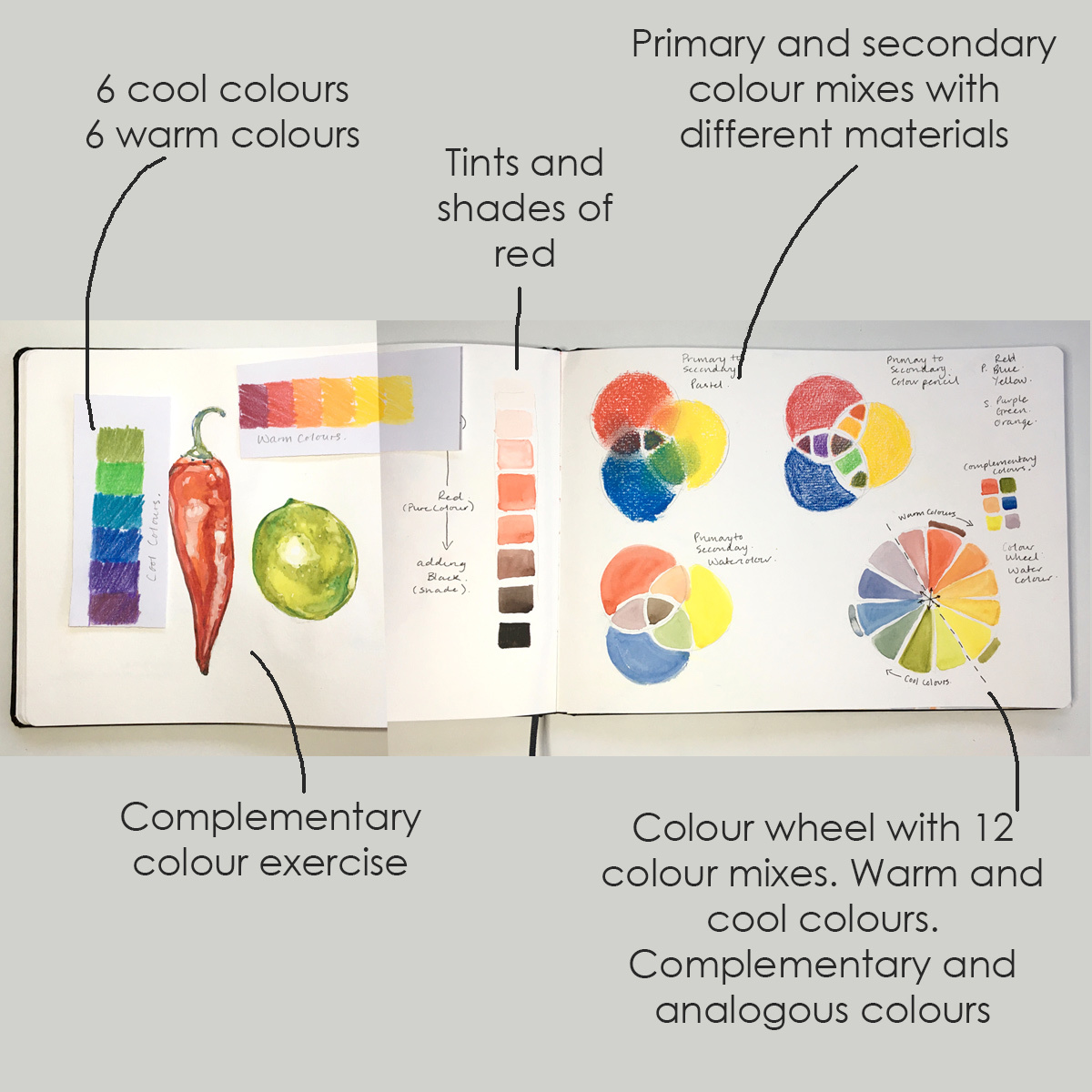
Exercise 1. Primary and secondary colour mixing.
Draw 3 overlapping circles with your circle template. In whichever medium you choose, add RED, BLUE and YELLOW into the largest area of the circles. Where those circles intersect, mix those colours together to get your secondary colours. I used 3 templates and 3 different sets of mediums: Pastel, watercolours and coloured pencils.
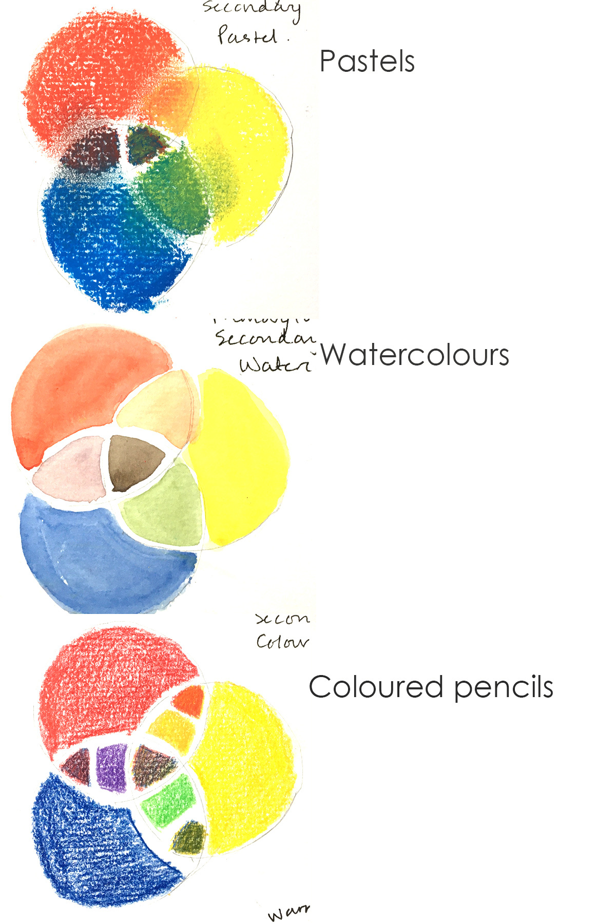
Look how the different mediums mix to create your secondary colours. Do you need to pre-mix them or can you layer them over each other? My coloured pencils weren’t great for blending (they aren’t really designed to with their waxy binder which is why they are available in so many colours) so I selected an orange, green and purple from the set to see how they compare.
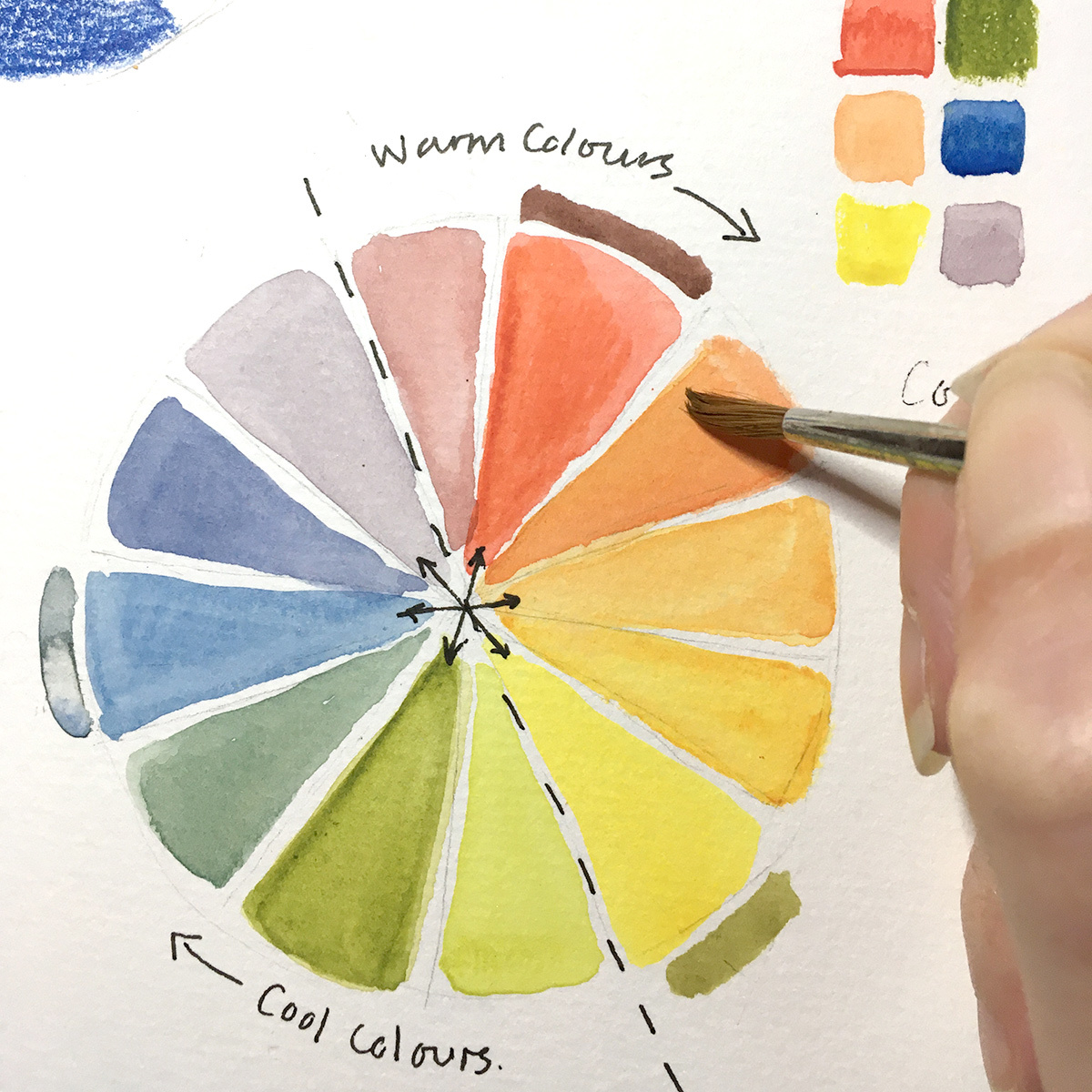
Exercise 2. Colour wheel.
Draw a larger circle and divide it up into 12 equal sections (I did mine by eye). Paint/colour one of those sections in red, then leave 3 spaces and add yellow, then leave 3 spaces and add blue.
Now add your secondary colours by mixing them and adding them to the section in-between your primary colours. Your secondary colours should now be opposite your primary colours. Green opposite red, purple opposite yellow, and orange opposite blue.
These opposite pairings of colours are called ‘complementary’
Finally, mix up colours between your secondary and primary colours. This adds another 6 colours to your colour wheel and gives you that rainbow selection to choose from. Colours that are next to each other on the colour wheel are called ‘analogous’.
You can buy colour wheels, and they are very helpful indeed, but it’s a really useful exercise to create your own versions. It makes you think about colour combinations, layering of colours, consistency of paint or pressure of pencil, and what you can achieve with your own mixes. Above all it’s a brilliant excuse to get the paints out and create rainbows on a dull January day.
Exercise 3. Complementary coloured objects.
I would like you to take 2 objects, of complementary colours, and paint/pastel/draw them trying not to use black or white. I used a red chilli pepper and a green lime. They don't have to be food, they could be anything, as long as they are opposite each other on the colour wheel.
Using your colour wheels think about how you can use analogous or complementary colours in your composition to suggest shading and highlights.
Further Reading
The Impressionists were masters at using colour to capture the effects of light. They encouraged painting outside, ‘en plein air’, in order to capture the ‘impression’ of light on objects through their use of colour. Look at Monet’s series of Haystacks or his paintings of Rouen cathedral to see how he used combinations of analogous or complementary colours to suggest the time of day.
The Expressionists were a group of artists that turned away from realism and used colour to communicate emotions and feelings. Take a look at the work of Vincent Van Gogh, Henri Matisse, Paul Klee or Francis Bacon to see how this movement used colour in a different way to the Impressionists. I've added a number of their images to a 'colour' board on Pinterest, you can take a look here Pinterest.
The way that 'brands' use colours is really interesting. Graphic designers select colours that speak to you on an emotional/subconscious level. Blue for example is calm and reassuring. You will see it used a lot in banking logos. Green is fresh, natural with an environmental resonance. Yellow is fun and vibrant. Take a look at some of your favourite brands and see how they are employing colour to communicate with you Branding Colors: Everything You Need to Choose Your Brand’s Color Palette (99designs.co.uk)
Glossary of colour theory terms
Hue – the colour itself, determined by its wavelength
Saturation – the intensity of the colour (think of a rainbow at full strength versus one that’s just about to fade)
Value – the darkness or lightness of a colour (remember our 9 step-value scale? It’s that, but applied to colour)
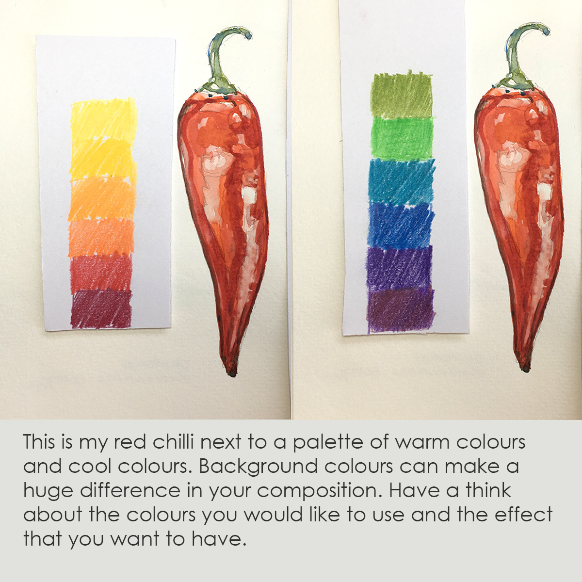
Warm and Cool colours - Red purple/red/red orange/orange/yellow orange/yellow are classified as ‘warm’ colours whereas yellow green/green/ blue green/blue/blue purple and purple are classified as ‘cool’ colours. Warm colours tend to push forward, whilst cool colours recede. It’s a really useful trick to know when adding depth to a landscape painting, emphasising the atmospheric perspective with trees or mountains that are cooler and bluer compared to the foreground.
Tint and Shade - Black and white aren’t in the colour wheel, but we can use them to add lightness or darkness (value). Adding white to a colour, to increase its lightness is called a ‘tint’. Adding black to a colour increases its darkness and is called ‘shade’.
Here's my final double page spread in my sketchbook, full of information about colour and its relationships along with a still-life study that I can use as reference for colourful projects in the future.