Crypto, and more specifically the blockchain technology, is here to stay. It is, however, a very difficult technology to get to know, which is why I was delighted when a friend of mine told me about the SwissBorg Community app. A game to teach new users how to read the charts to reduce the risk of investing in crypto, Swissborg is definitely a worthy new contender in the crypto world worth looking at!
After downloading the game and starting to play, with no initial hick-ups, I decided to do a deeper dive and look at how well the game mechanics have been applied or could be better. After all, I've spent the past decade researching games and game thinking with the goal of applying it to non-game environments!
Predict, learn and earn Bitcoin
Based in Switzerland, the goal of the game is to help you predict Bitcoin patterns better in order to hold onto your wealth. It is thus ideal for anyone new to the world of cryptocurrency and interested in financial freedom.
I chose a millennial white-collar worker as the main persona for the game. Someone who has a professional day job and fairly educated, but far from an economist or technology lover. Just an average Joe with an average job with a long-term goal of growing his or her savings.

Knowing that the target audience is someone with limited free time, it is thus crucial that the game is as easy and engaging as possible to keep him coming back.
The numbers
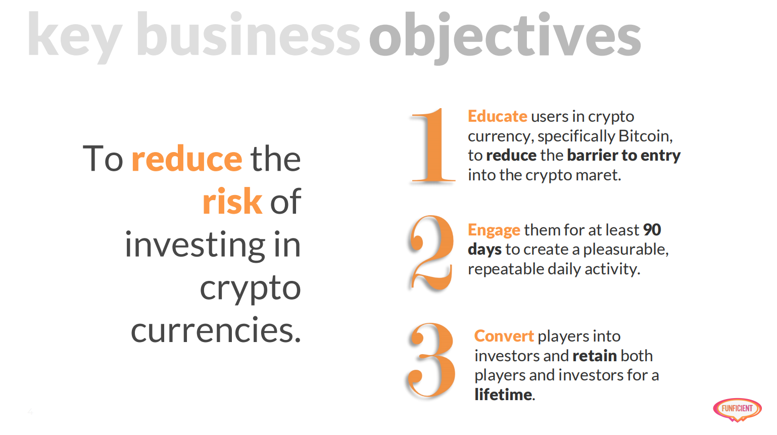
Gamification differs from games in one primary aspect. It starts with key business objectives rather than just wanting to have fun or entertain. Looking at the app and the website (and not affiliated with Swissborg at all other than my friend who works for them telling me about it), I derived that the primary business objective is to reduce the risk of investing in cryptocurrencies particularly for new users.
Because of the complexity, volatility, and of course that you have to use real money, crypto remains too risky for the majority of people I know. In a previous Ethereum hackathon our team's primary problem statement was exactly this, and our answer, surprisingly, included both a game and a learning portal, so it makes sense that this too is the key business objective of Swissborg.

Supporting this key objective, I selected three main business objectives to focus on for the purpose of the product teardown. The first focused on the educational aspect, and how to make it easier for new users to become familiar with crypto. The second revolves around engagement while the third focuses on the conversion of players into actual users.
Keeping these objectives in mind, I spent the next month playing to see how well they measure up.
Top 3 improvements
Learn better
At the top of the list is a small, but rather important change. With education as the core driver behind the game, I found little opportunity guided by the app to improve my knowledge about cryptocurrency and trading. I first glanced through the articles on their blog for inspiration, however, couldn't really find very useful material there, so scrolled through all the various options on the app itself to see what they can teach. What stood out to me was the ability to see the patterns of investment.
One thing that is generally not taught by any other crypto app I've looked at and is quite useful, is the basics of trading and the ability to read the different patterns. Plus, there are countless different possibilities making it perfect for a game that needs to have different information displayed daily to keep it engaging.
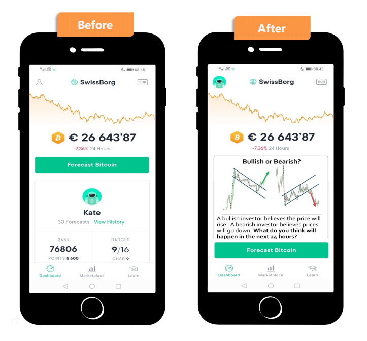
I took this as inspiration and redesigned the main dashboard as you open the app every day, and added a educational card before asking the user to forecast.

As you can see above, the current mobile designs (left hand) use nearly a third of the available space to show the users name, which doesn't make much sense at all for a personal account on a personal mobile phone. Even more so when you notice the profile icon in the top left hand corner allowing you to view your profile (and consistent with most mobile app layouts).
So I moved the avatar to the top and moved the dashboard section with the stats slightly down, inserting an educational card before the main call-to-action on the page. The intention is to have similar bite-sized chunks of learning material each day to help users learn to read patterns. The first and obvious starting point is to identify whether there is a bull or bear pattern. Thereafter the patterns can be analysed and updated daily to identify the previous 24 hour's pattern, which provides an infinite number of uniquely different screens, which is equally useful for the new learner and advanced user.
Engage better
Additional to the above suggestion, which will give the user a reason to come back every day until they have mastered all the different patterns, there can also be a few small changes to the feedback screen to increase engagement.

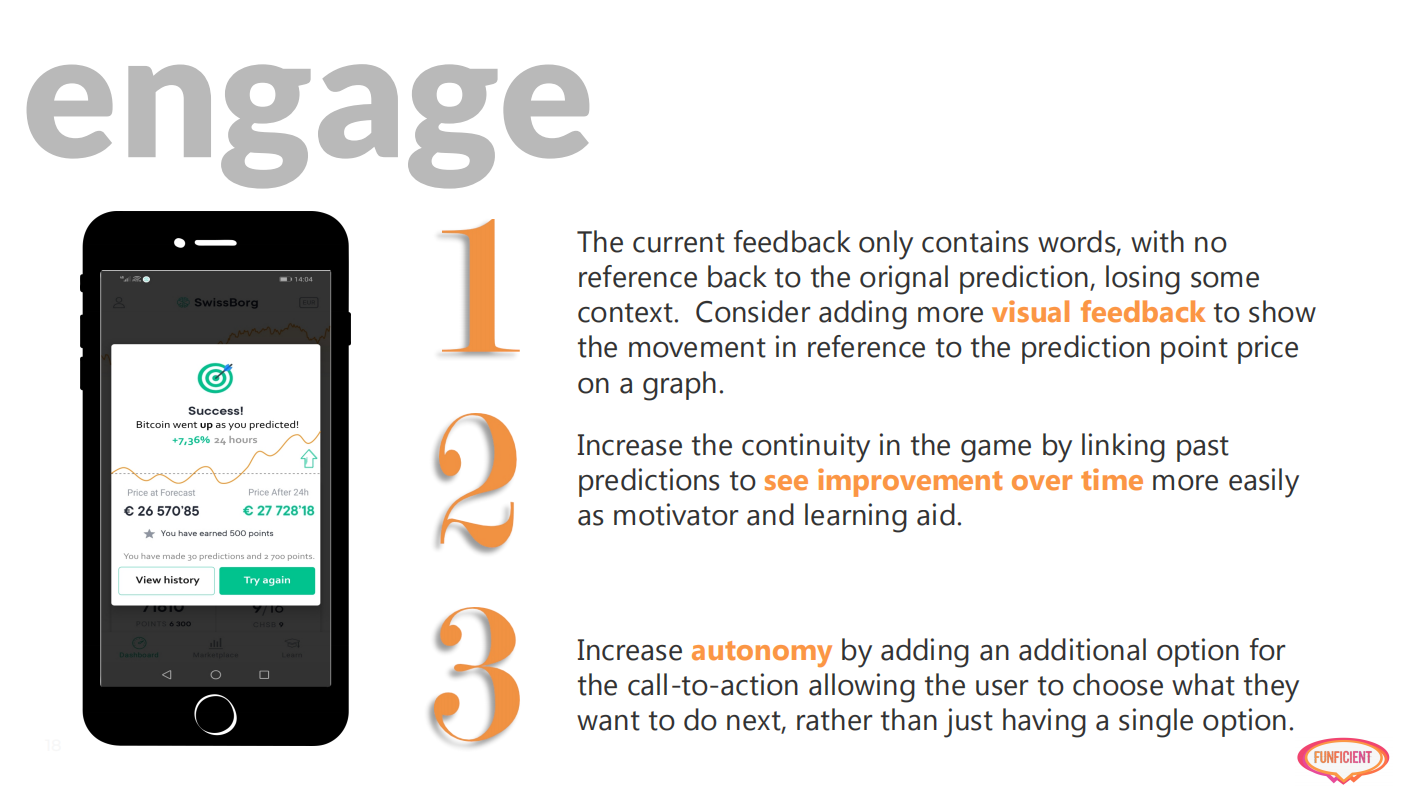
After my first few tries at predicting, feeling very confused, I sat down to try and identify why. After all, the designer made very good use of colors, there's a success message and even the exact amounts. Reading the words made sense, but it didn't leave me feeling I understood why I got it right or not. Not obvious, finally one day I realized it is because there is no reference back to my original prediction made based on the graph.
Maybe this is just the way I think, however, I don't believe I'm the only one. When I make my predictions I mainly look at the graph to decide. The values mean very little to me, in fact, I ignore them most of the time. However, the feedback page only contains these values, no graph. So even though I can see it went up or down, there is no connection back to my prediction that helps me anchor the pattern in my brain.
Simply adding the same graph as in the mockup above, with a straight line to indicate the value as it was the moment you estimated, greatly improved my learning journey.
To strengthen this, I added a "View history" button that more easily allows the user to compare previous predictions and whether you are getting better or not at predicting. Ideally, the previous predictions should also be visualized but just being able to look back and see my personal progress is motivating enough to want to predict again.
The side benefit of the added button is that it increases autonomy with the main rule of game-design, namely providing a user with choices.
Convert better
The final top recommendation to improve the final, but notably most important, business objective, is to slightly redesign the dashboard section to make it more visual, and end with a final call-to-action to invite users to buy actual Bitcoins.
Currently, although there is the promise of earning real money, I have no idea how or even if I ever will get rewarded with actual money. This, doesn't bother me so much though, as my primary goal is to get better at reading and interpreting the trends. It would be a very nice incentive to give users enough money to allow them to onboard onto the actual platform to get started there, similar to Crypto.com who gave referral bonuses. It would, however, be good enough if I could seamlessly transition from the game to a real application. Or at least, be reminded to consider it each time I successfully made a prediction.
If the goal is to get users to invest in crypto, it should be as easy as possible to transition them. If they have to download another app, they might as well download any other app. If, however, it is seamlessly integrated from within the game, there would be much more reason for users to remain loyal and keep playing.
Another alternative is to consider NFT's as reward like Crypto Kitties, which will motivate users to play more in order to collect more unique (and beautiful or cute) tokens.
For the full report click here. If you would like a similar review of your product or service, visit www.funficient.com or send me an email here.
