
After a week of cold arctic air, several new features have been introduced including wind chill graphs and a snowfall history graph. Avalanche Canada also suggested updates to the Backcountry section which have greatly improved the daily report.
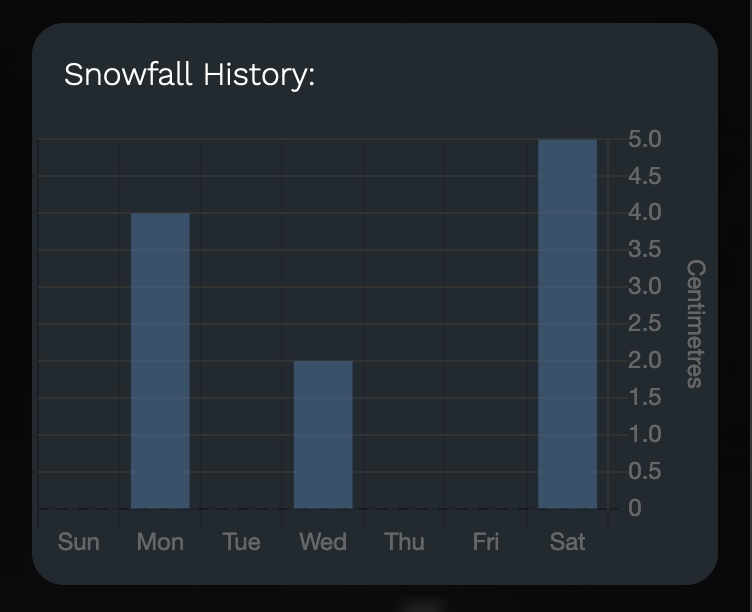
Snow Report - Snowfall History and Wind Chill Data
Improved weather graphs section
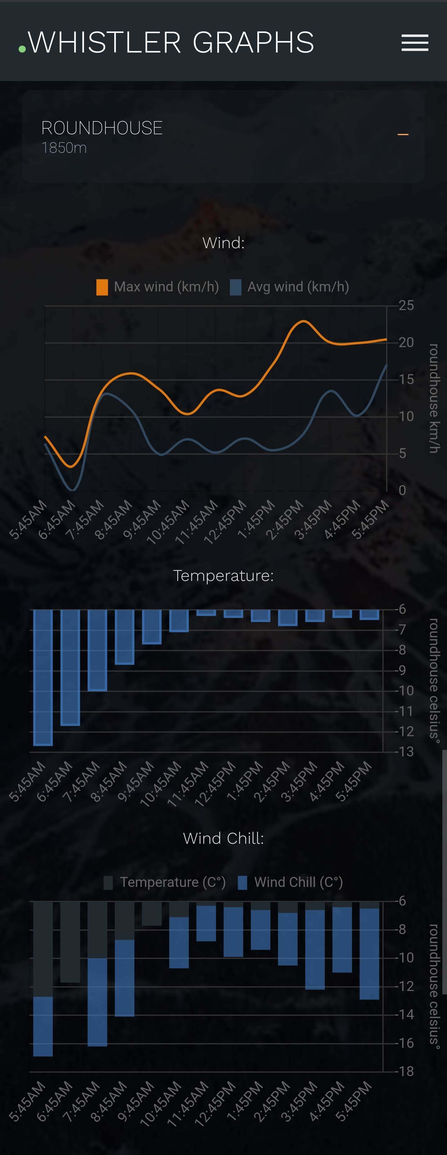
Each weather station has a selection of graphs. You'll find wind, temps and wind chill charts for most of the stations. Pig Alley also includes a snowfall chart.
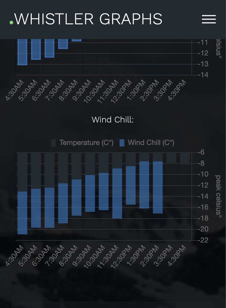
The wind chill chart shows in darker colours the regular hourly temperature readings. Stacked in blue displays the increased value when calculated with the average wind. Note that gusting winds affect the wind chill even further.
Wind chill formula used:
wind chill = round((13.12 + 0.6215 x temperature(c) - 11.37 x pow(average wind,0.16) + 0.3965 x temperature(c) x pow(average wind,0.16))
Environment Canada Calculator:
https://weather.gc.ca/windchill/windchille.html
Wind chill temperature approximates how cold your skin feels, not how cold your skin actually is. More:
https://whistlerpeak.com/snow/events/
Improved Backcountry Reporting
https://whistlerpeak.com/backcountry/
After feedback from Avalanche Canada, additional details and reporting information has been added to make the forecast more complete.
Issued and valid date colours
Green indicates that the report has been updated and is valid:
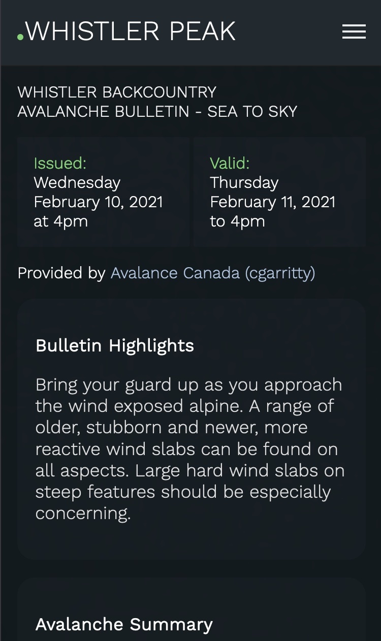
Red indicates the report is past valid date (reports may be updated after 4pm each day):
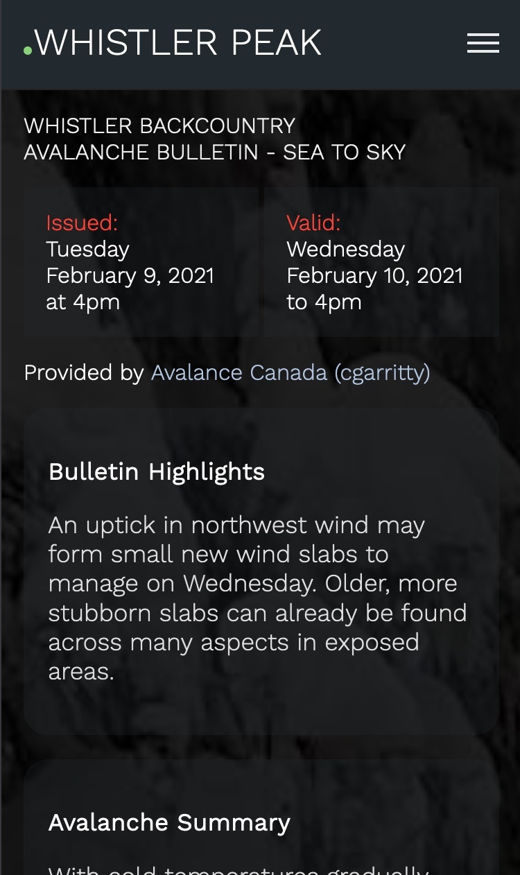
New details include:
Bulletin highlights
Travel advice
Report confidence
Resource links
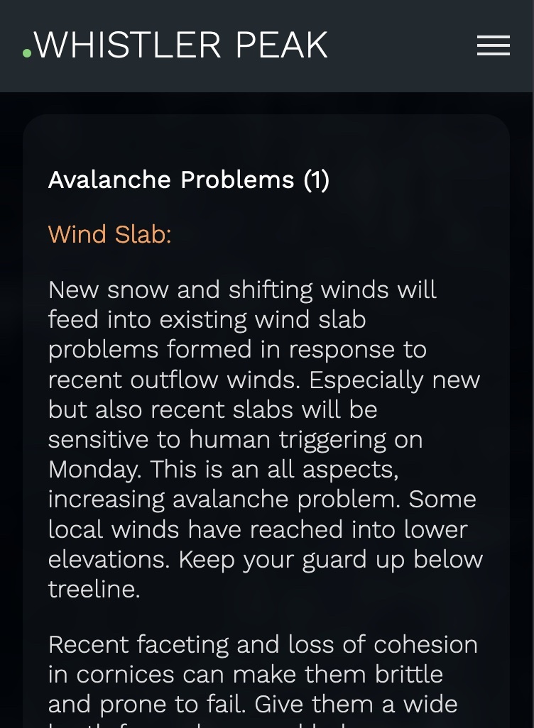
The avalanche problems section has also been greatly improved.
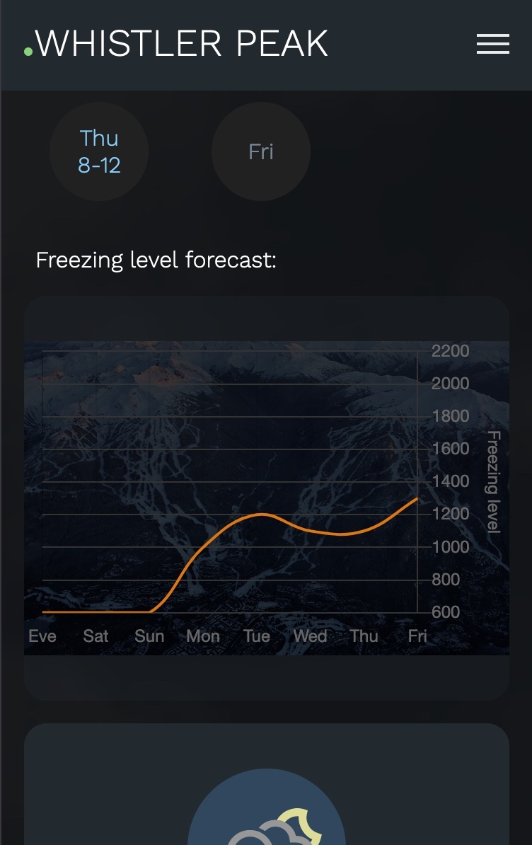
Alpine Forecast - RWDI Freezing Level Graph
https://whistlerpeak.com/forecast/
A reference image has been added behind the freezing level chart for the RWDI alpine forecast. The reference image is a guide only and not to exact scale especially with some devices. Since desktop sizes can vary, this is only available on smaller mobile devices. When the freezing level drops to below 600m (Valley), the graph point will still appear at 600m to help indicate a reading:
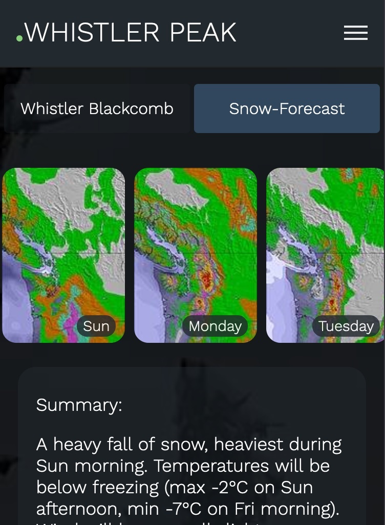
Alpine Forecast - Snow-Forecast
Scrollable images for each day in the forecast have been added as a strip on the top of the page:
Hope you're enjoying the site and staying warm. Follow David Jones for his fantastic Powder Picker to know when the next storm hits us. David's videos are available here:
https://whistlerpeak.com/video/
Enjoy the snow.