
Hey everyone,
It's been awhile since I made a post here, but I'm hoping to change that in the near future. My plan would be to post once a week, so I will see how that goes.
Anyways, today I am going to talk about fine art prints. I've wanted to print my photos on high quality paper that will last a lifetime, but never knew where to start. Then I noticed the lab that I use was having a sale on fine art prints and figured this would be a great time to test them out. In the past I would usually print my photos on metallic paper. The paper is rich with color and provides a shine like no other paper can provide. It can almost appear as if the print is illuminated from behind when the right light hits it. While I really like the paper, I was always looking for something else. I was hoping to elevate the print into a more polished work or art. I've tried printing images on luster and matte finished paper, but was never fully happy with the results, so I stuck with metallic paper. Don't get me wrong, I really like the paper and a lot customers really love the look of it too. I'm just looking for an alternative paper. The one caveat is the price. Just like anything in life, the higher the quality, the higher the price. Each style is significantly more expensive than traditional luster, matte, or metallic paper. However, the quality of the paper is greater.
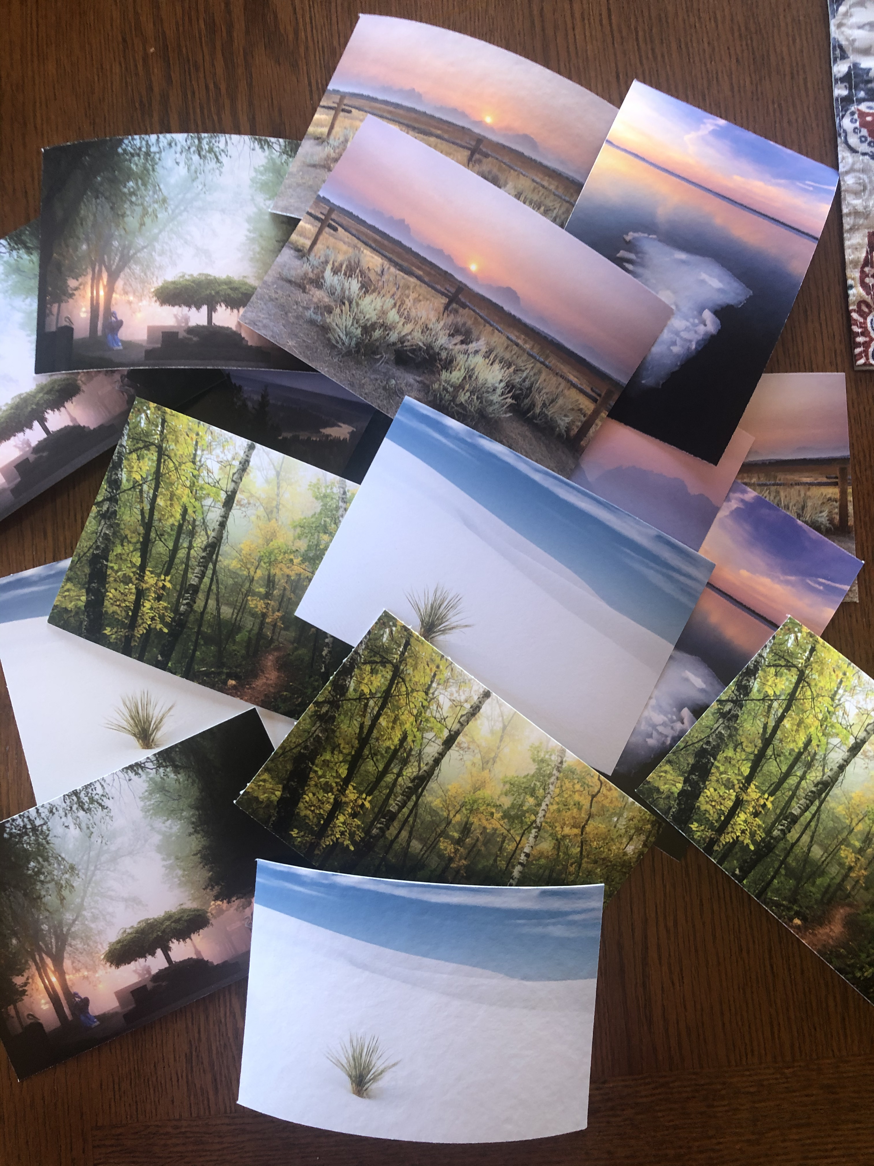
The lab I use offers four varieties of paper that they call fine art. First there's the smooth matte, then they have velvet, next is Torchon by Hahnemühle, and lastly they offer Photo Rag Baryta by Hahnemühle. They all are 100% cotton paper, except for Torchon which is a pure cellulose watercolor paper. I decided to focus my attention to three types of paper. The one I didn't buy was the smooth matte.
All three styles of paper have exceptional quality and think certain images work best for particular styles of paper. However, there are some drawbacks to some of the styles. I chose six different images and printed each image on each photo paper so I would have a total of 18 prints.
The first paper is Velvet. The paper is 100% cotton and it has a texture surface. It feels like watercolor paper. The next paper is Photo Rag Baryta by Hahnemühle. This too is 100% cotton paper. This one is slightly textured and has also has a small shine to the image. The last style of paper is Torchon by Hahnemühle. This type of paper is pure cellulose watercolor paper. This one has zero shine, but has a heavy distinct texture. All three papers have a significant thickness and weight to them as well which immediately gives the images a more professional look.
SIDE NOTE: I should be wearing gloves when handling these prints since my fingers can release oils and damage the prints. But for the sake of the experiment, I decided not to.
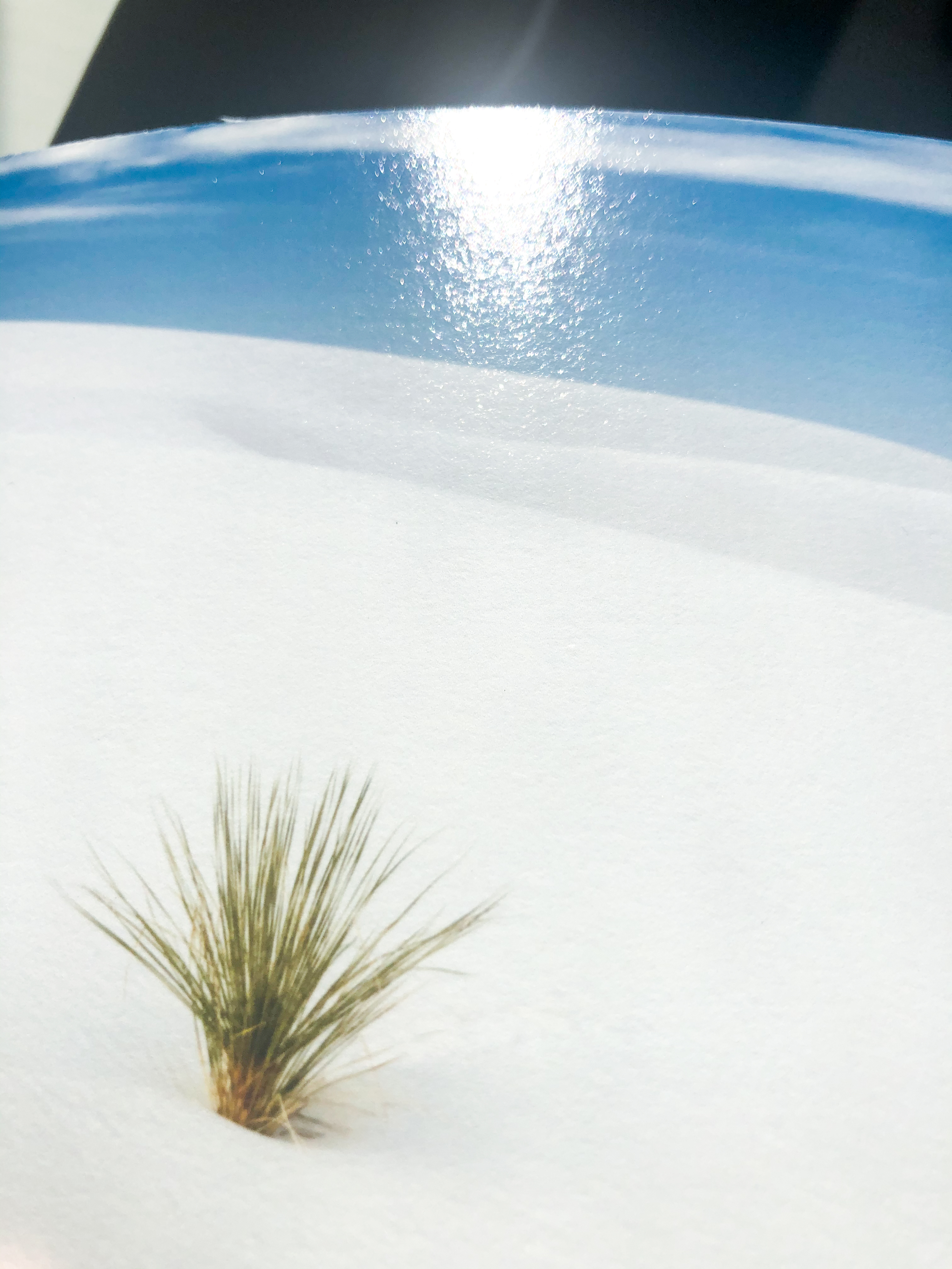
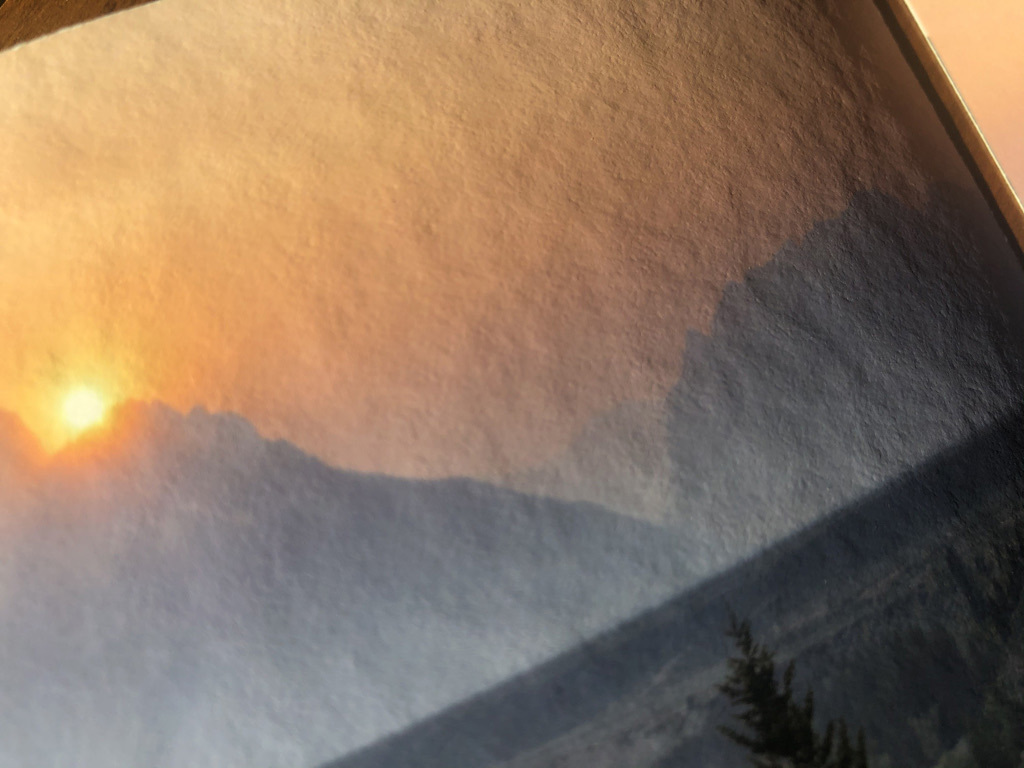
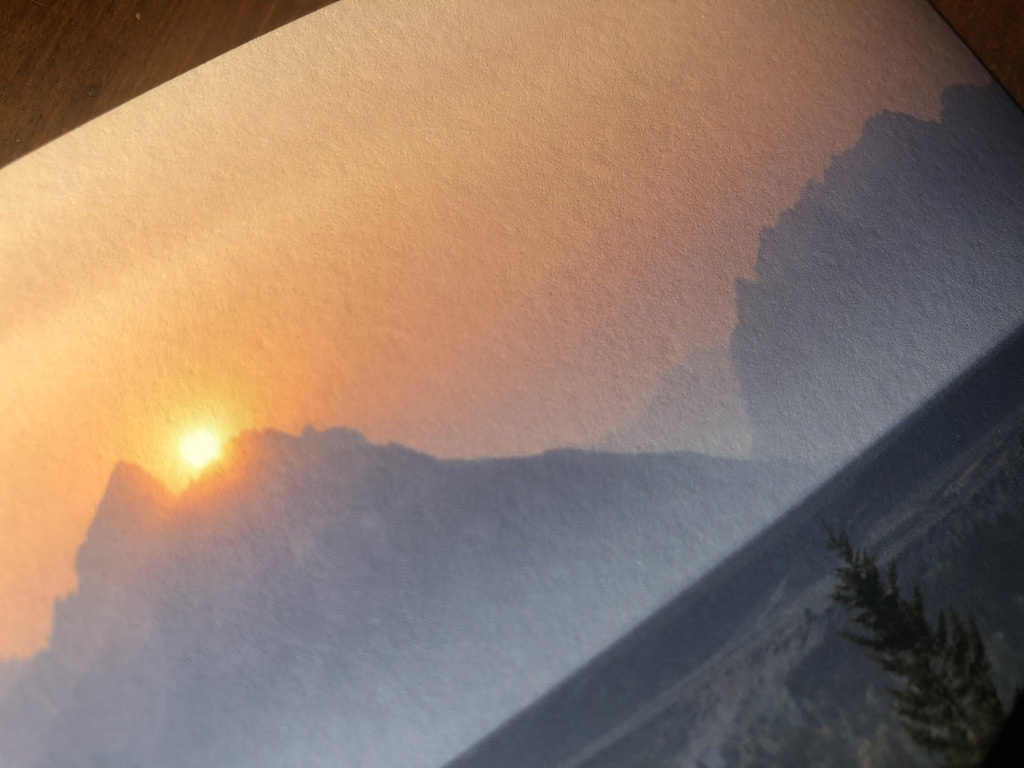
This is an image I took in White Sands National Park. While it's difficult to fully photograph the feeling of each print, you can still notice the differences in each one.
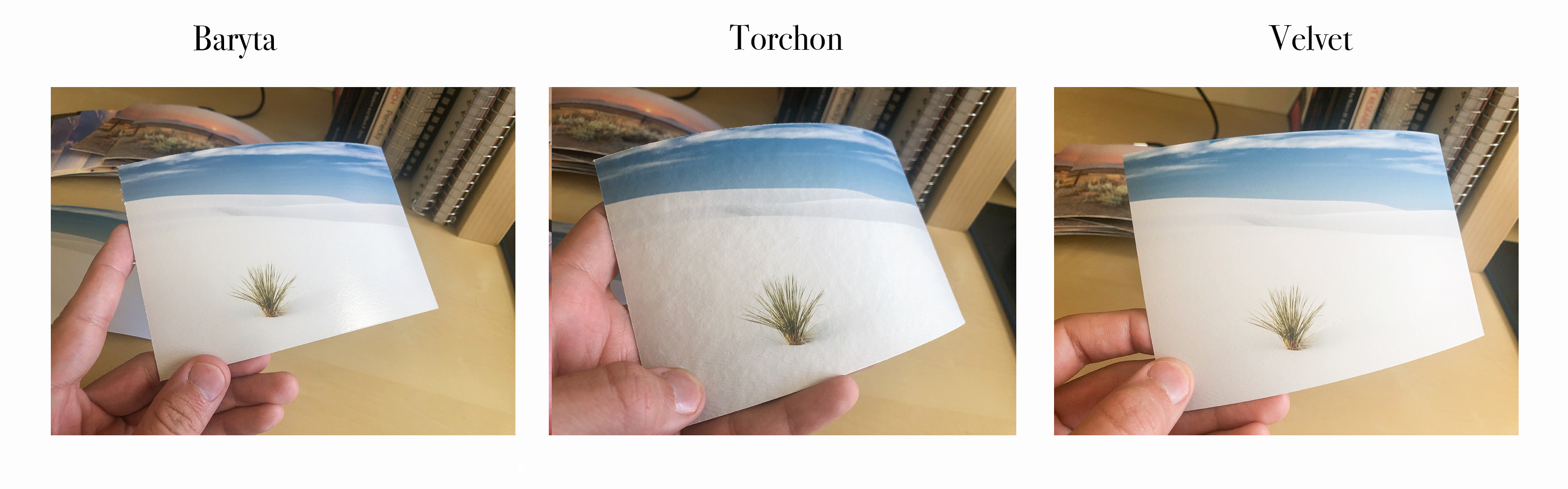
My order from least favorite to most favorite in this example would be, Torchon, Baryta, and Velvet. The Torchon has almost too much texture for this image and takes away the smoothness of the image. The Baryta works pretty well and I would probably really like it, if I didn't see the Velvet paper. Baryta has a slightly warmer tone compared to the other two, or at least they do in person. It also has a touch more saturation. There is also a small shine to the image. It's nothing too big, and not nearly as much as the metallic paper. It's not really a deal breaker, but you can see some glare in the image above. There is also some texture to this paper. It's almost pebbly when you catch the glare, but not nearly as noticeable as the other two. Lastly, is Velvet. I can't believe the quality in this paper! The colors are perfect. Unlike the Baryta, the color balance is more neutral which makes the sand an almost pure white like it is in person. This one also has some texture, but not as much as the Torchon. It's almost a mixture of the other two styles, but unlike the Baryta, this one doesn't have the glare.
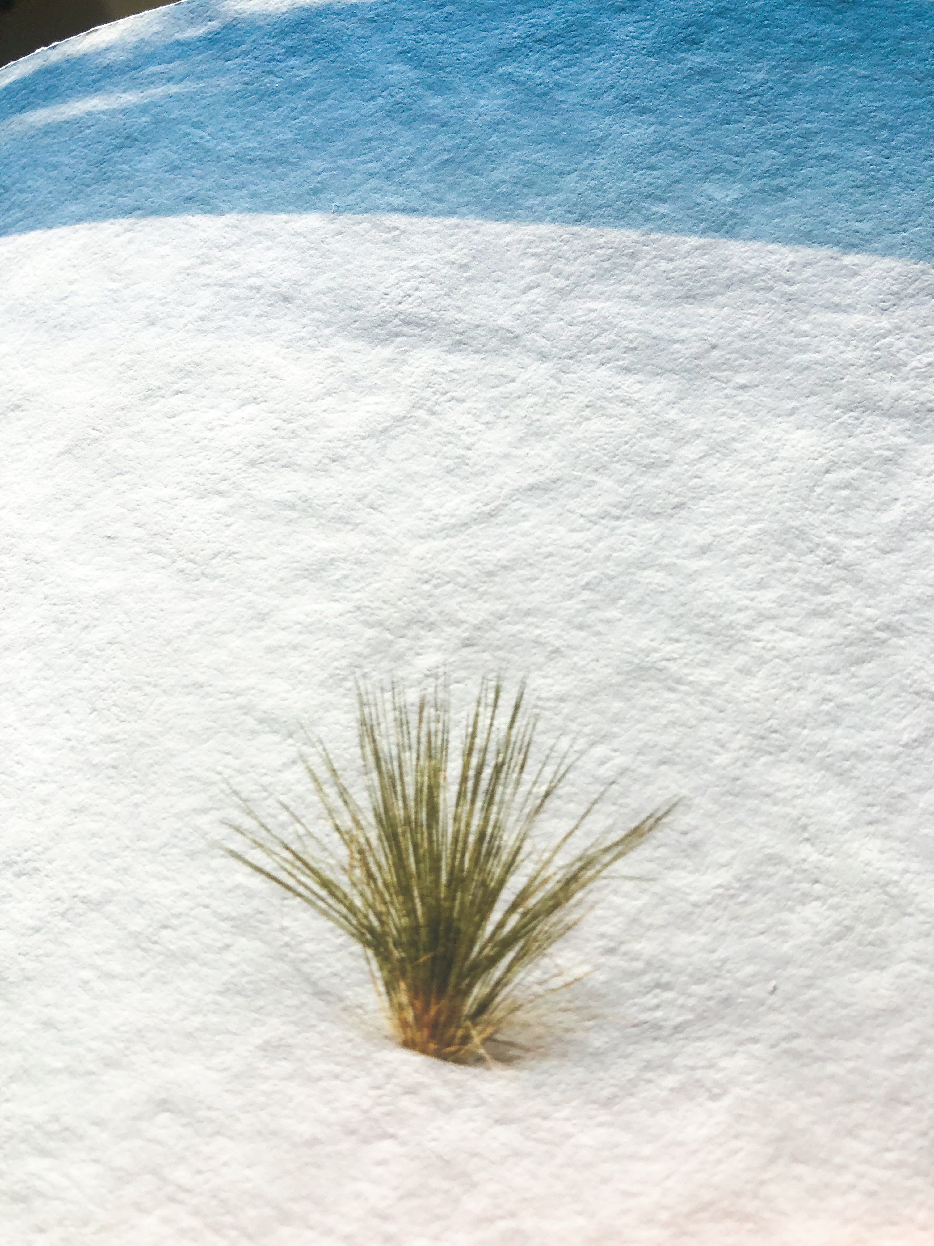
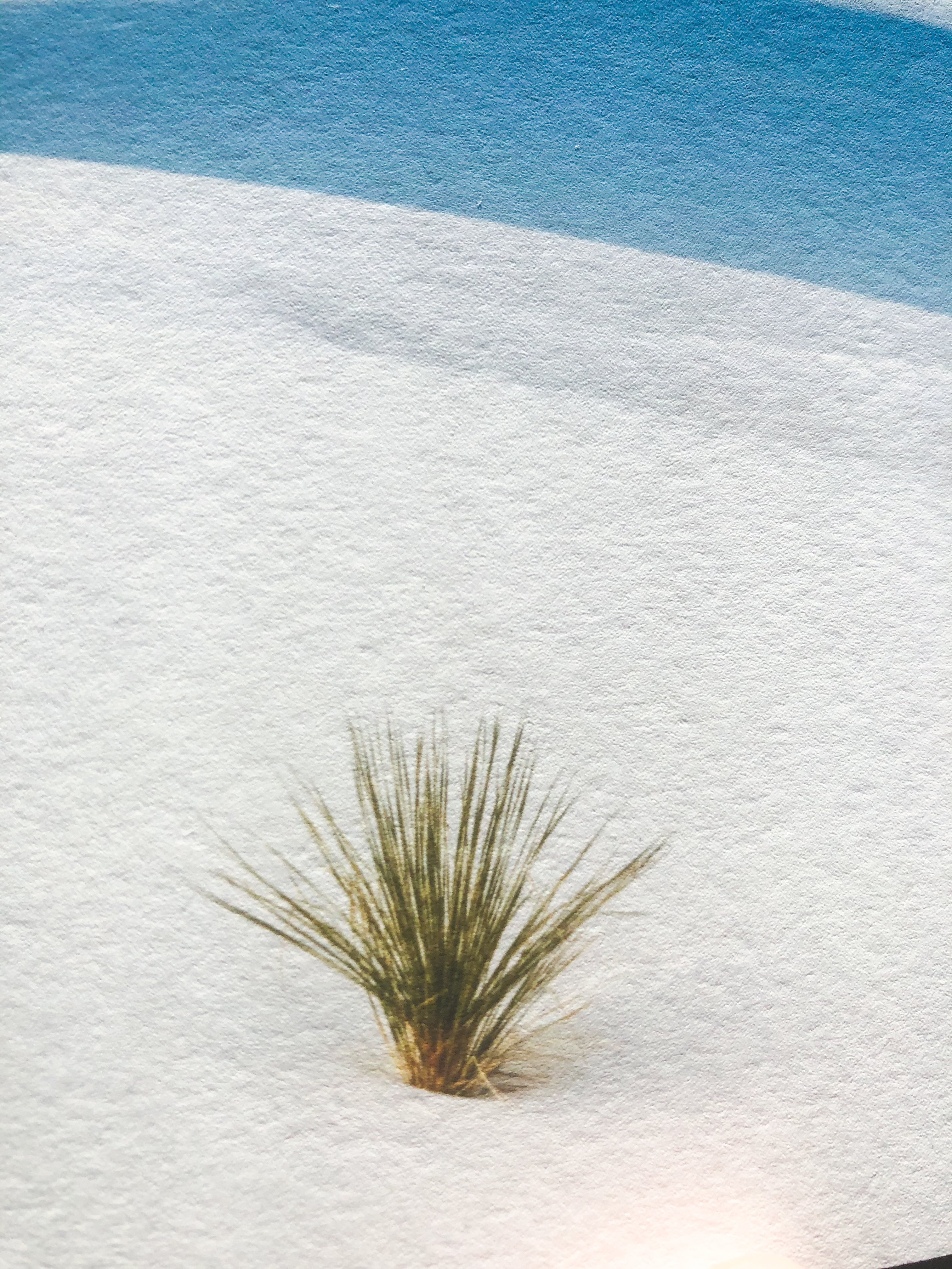
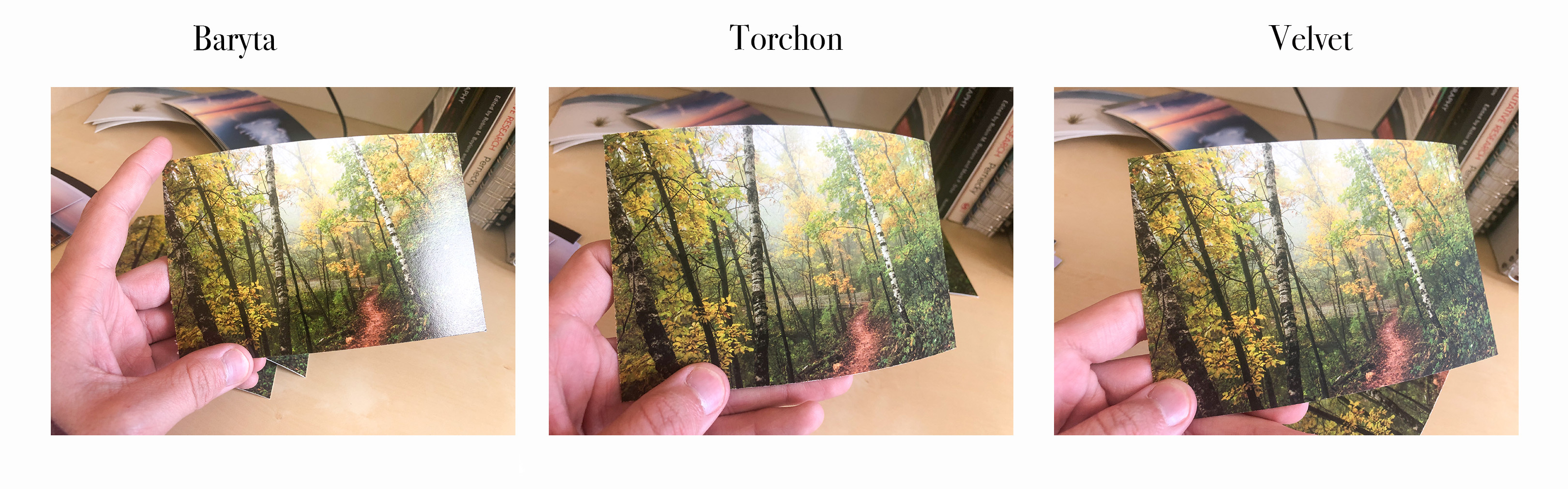
Here's a close up of each style.
Torchon
Velvet
Baryta
From these (slightly out of focus) images, you can see the difference between the three. The Velvet has just enough texture to the print making it the best paper, in my opinion.
Now just because the Torchon didn't work well for this image, doesn't mean it's a bad paper. In fact, I really love the paper in certain images.
The order of favorite to least favorite would be Torchon, Velvet, and finally Baryta. While I think Baryta is a solid photo paper, it doesn't really work in this one. There's not enough texture to give off the woodsy feeling and there's not enough shine to make the forest glow like in my traditional metallic prints. Next, the Velvet paper( the one I said was the best in the sample before) comes in second. This paper once again is phenomenal. I really can't say anything bad about this paper. Lastly, the top of the class goes to the Torchon. I give it the slight edge for this image just because there's a bit more warmth and saturation to it. It's not super noticeable, but you can see it in the brown/red dirt path. Also, the extra texture in this paper gives the photo just bit more depth. So unlike the last image of White Sands where the extra texture was a bit of distraction, it actually helps to elevate this image.
Here's another example:
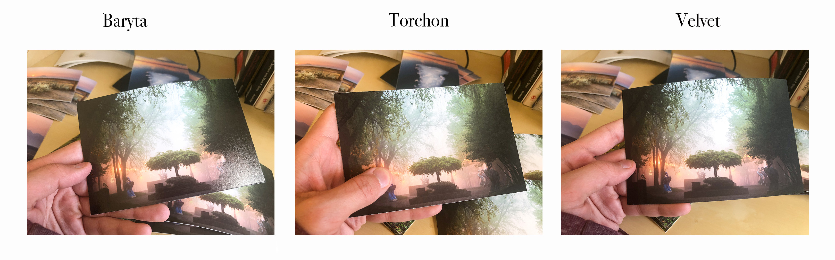
Baryta comes in last place once again. It's not a bad paper by any means. I'm sure it looks great for certain scenes. I just find found that from the six images I printed out, Baryta was never my favorite. It was either second or third each time. For me I just don't think there's enough shine to image. I might have to experiment a bit more as well so things could change. Now, these next two were pretty much a tie. In fact, I wasn't quite sure which image belonged to which paper in the photos above until I took close inspection. But, I gave the top choice to Torchon. The colors are just a bit warmer, which can be seen in the tree. The added texture gives the image a boost. That being said, Velvet is really great too. Zero complaints about it at all.
I chose six different images and tried to find ones that were different from one another. Throughout the experiment, I found out the overall Velvet performed the best in each scenario. Even though Torchon was my favorite in the last two images, it didn't perform as well in other images. In each image it didn't perform well, the image had a lot of solid color, either in the sky or in the foreground. Case in point, the White Sands photo. There's a lot of solid color in the image. It's mostly made of white with some blue at the top. The textured paper was a bit too distracting for my taste. However, it performed well with more woodsy scenes. In fact, the added texture made the print better.
Here's another example of a solid color sky with just Torchon(left) and Velvet(right).
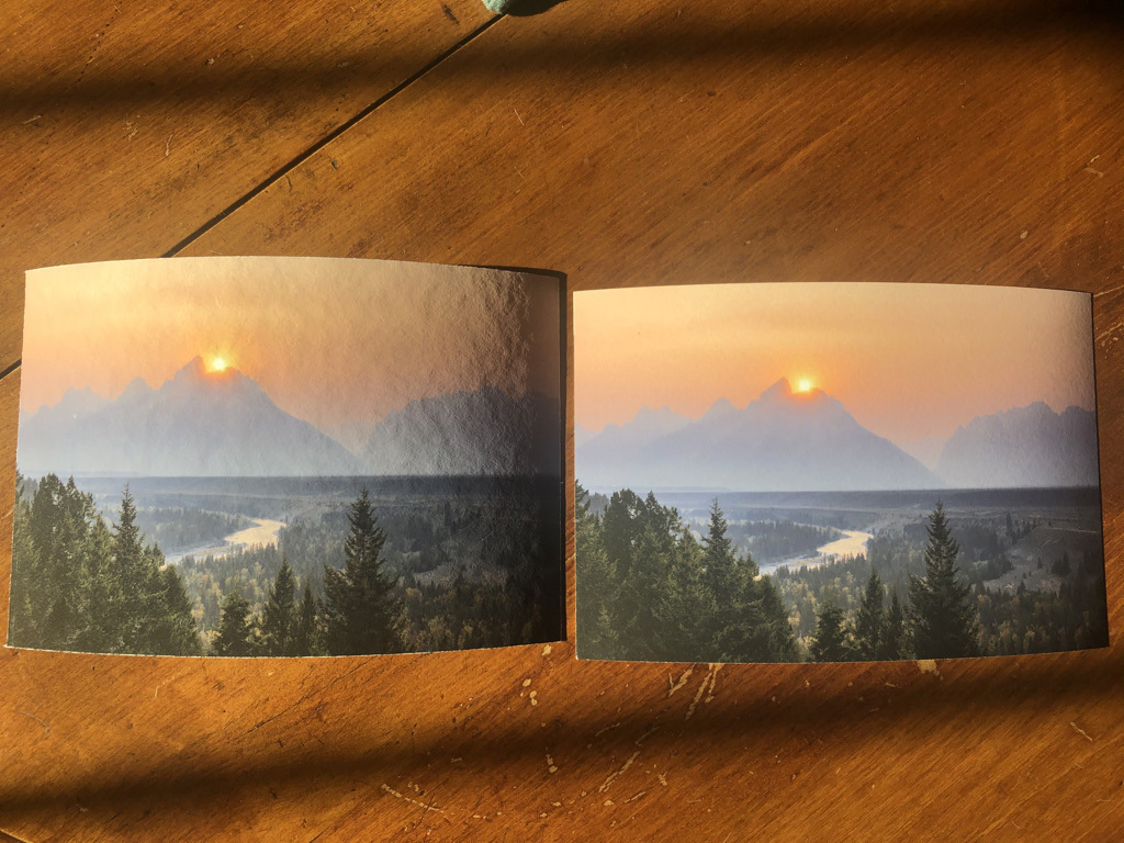
And here's a closer look of Torchon.
And a closeup of Velvet.
As you can see, the Torchon is heavily textured, while the Velvet has a subtle texture. I think the Torchon looks great in the foreground, but it's a bit distracting in the solid orange colored sky. So my favorite paper for this image, is Velvet. I didn't include Baryta in this example, but it came is second. Again, the solid color of the sky is what brought down the Torchon paper since you can see all the blemishes of the paper.
Here's a breakdown of each paper.
Bartya: Colors have more saturation, has some glare and some texture. It's a quality paper, but just not my favorite from the examples I printed out.
Torchon: Zero glare. More saturation than velvet but less than Baryta, slight warm tones, and heavily textured.
Velvet: Zero glare. The least amount of saturation between the three, but still very colorful. More neutral tones. Textured paper, but not as much as Baryta.
One thing I noticed about all three papers when compared to my usual metallic paper, was the amount of visible detail in the blacks. A lot of times with metallic paper, the image will print just a tad darker and I lose detail in some of the blacks. In these examples, the blacks appear to be a bit more lifted which gives more detail in the shadows. This can be both a plus and a minus depending on the style of image. Sometimes you want the really darkened shadows to give more contrast, but I think there aren't as many instances that fit that criteria.
Overall through my experiment, my favorite paper goes to Velvet. It was either my favorite or second favorite for all six of the images I got printed. I never once marked it down as bad or even mediocre. Velvet would be the safe bet to have for almost any of my images printed. While Torchon could perform better on certain images, it could also knock the image down just a bit. While all three types of paper have some curl, the Torchon has a significant curl. This shouldn't be an issue once it is framed, but it's just something to note. I also only printed out 4 x 6 prints, so things may look different when blown up and fully displayed in a frame and behind glass. I'll eventually print out a large print on Torchon and Velvet, but until then, my favorite is Velvet.
I would eventually like to offer fine art printing in my online store. I'm not quite sure when that will be ready since it takes awhile to enter in all the date, but it would be nice alternatives to my traditional metallic paper prints I sell online and at art shows. However, if you are interested in ordering a print in my shop on fine art paper, please send me an email at [email protected]. I will be more than happy to assist you.
Thanks for taking the time to read through this post. I hope to make this a weekly thing and post something every Saturday.
Jason