
“Please sign in, log in, sign up, register to continue” texts that we meet most time on the websites, mobile, and apps. This situation happens in 2 different types: on a pop-up and a new page. So, which type is better for the user?
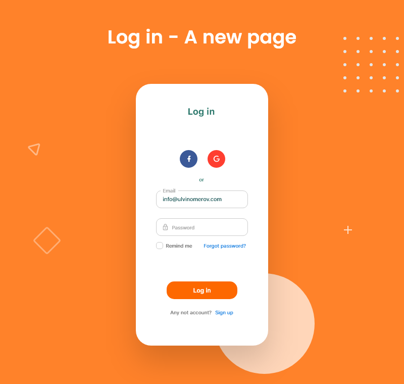
It depends on the site type. For example, if you design a standard site and want to keep the design clean, a new page recommended. Because the new page gives you a wide and clear screen, that you will not need to squeeze elements, texts, inputs, and others.
But if you design an e-commerce site, suggested using pop-up login, register, and so on. Why? That is the reason:
Take an example of www.amazon.com It takes you to a new page when you click on “Sign-in”. On the other hand, www.flipkart.com offers you a popup for “Login”.
Now take a scenario that you are searching for some product and after spending some time you finally find the product and you want to “Add to cart or Buy” and then you click on the sign-in button on Amazon and it takes you to a new page. Suddenly, the product you wanted to buy is not in your view. Amazon redirects you to your previous page after login. But that’s after login or giving a user a sense of fear that the user has to look for the product again.
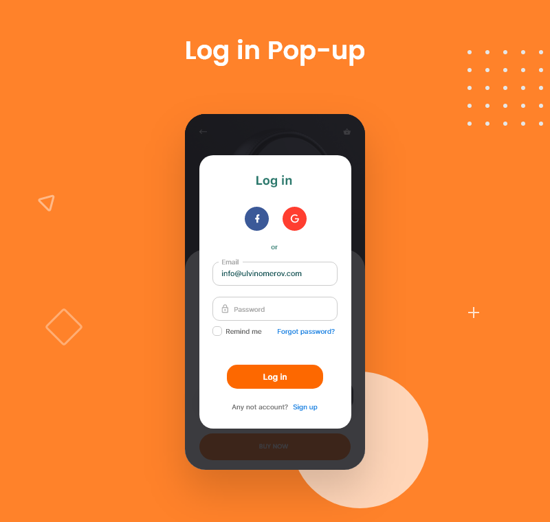
In the case of Flipkart (popup) the user stays on the same page while logging in without the fear of losing the page/product.
In conclusion, if the site is secured — a popup or the new page doesn’t make much difference. A popup would be easier for the user. It saves time, the user from having to direct another page.
If you find the blog helpful, give your help))