
Thanks to the rapid development of the Internet over the past decades, typography in interfaces has gone through the main stages of transformation into the digital world. But the design of mobile apps is still a new wave. In this article, I won’t talk about the general concepts of typography, which can be used both in print and in a digital environment. Instead, I will focus on nuances and hacks that can be used in the typography in mobile apps design. Because app development is very closely related to operating system features, I will often refer to individual recommendations from Material Design for Android and Human Interface Guidelines for iOs. So, let’s start.
Minimum Font size
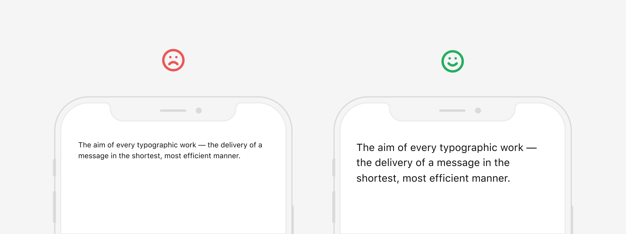
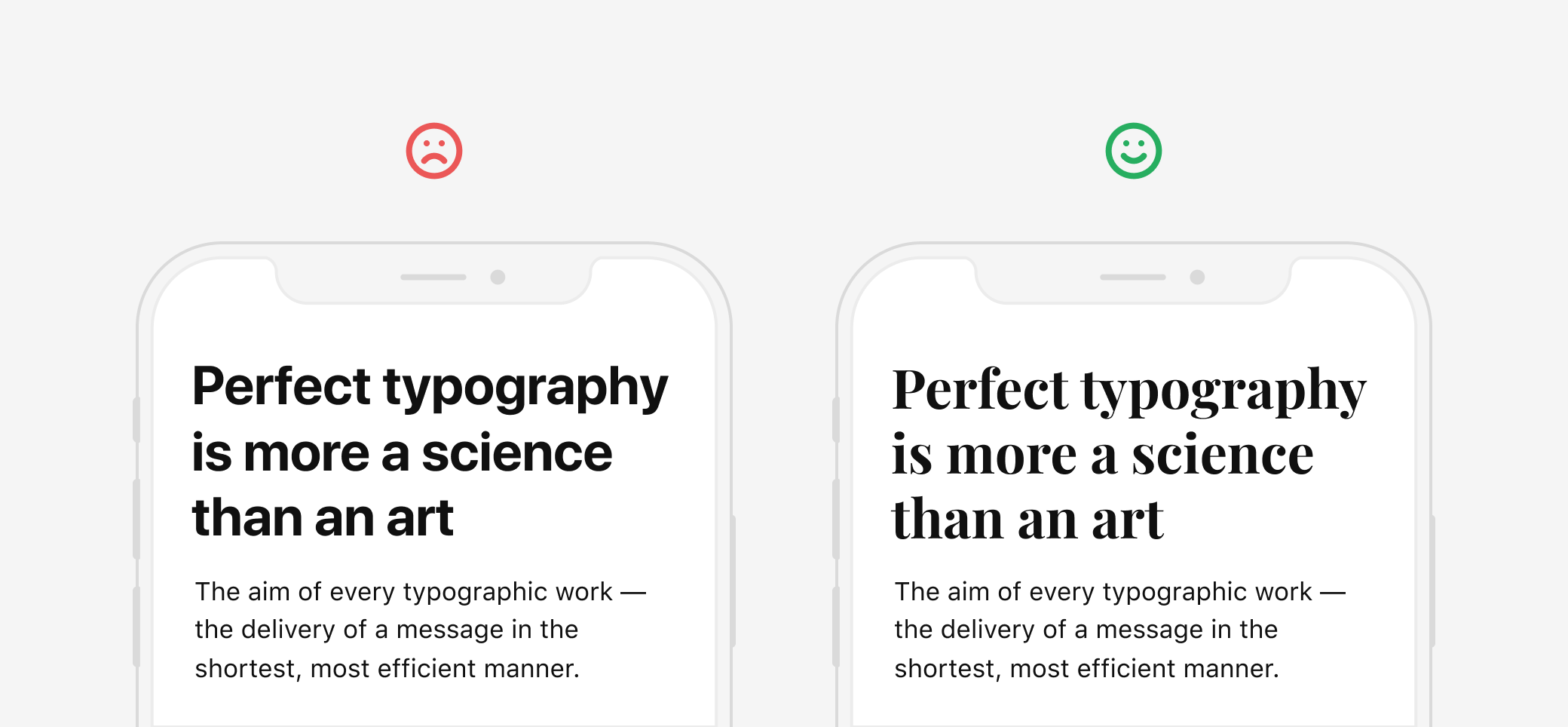
It’s no secret that mobile apps are often used on the go. Add to these limitations associated with the screen size, glare from the sun, various visual impairments among users, not always the best screen quality of smartphones and you will get the first ground rule governing the minimum size for body text.
Apple in its Human Interface Guidelines recommends setting the minimum size for Body text to be 17pt.
Google in Material Design guidelines recommends setting the minimum size for Body text to be 16sp (equal to 16pt in iOs) It’s necessary to take into account that recommendations from systems are given relative to their default fonts. This is currently the Roboto font for Android and San Francisco and New York fonts for iOs. Minimum font size for other typefaces may vary depending on their characteristics. For example, fonts that have very thin strokes require a larger size for body text. Also, WCAG 2.0 standards recommend following the minimum font size of 18pt and 14pt for Bold text.
The exception may be the various smaller Captions. But keep in mind that if the user cannot read them, it should not greatly affect the user’s interface comprehensibility.
Recommendations
Don’t use a font size less than 16pt for the Body text in your app design. A good size for the body text will be in the range from 16pt to 18pt
🤓 Pro-Tip
To make the typography of your app more accessible in iOs, you can apply Dynamic Type Sizes. Using this technology inside your app will allow users who set an increased or decreased font size in the system settings to see the interface of your app according to these settings.
Headline size
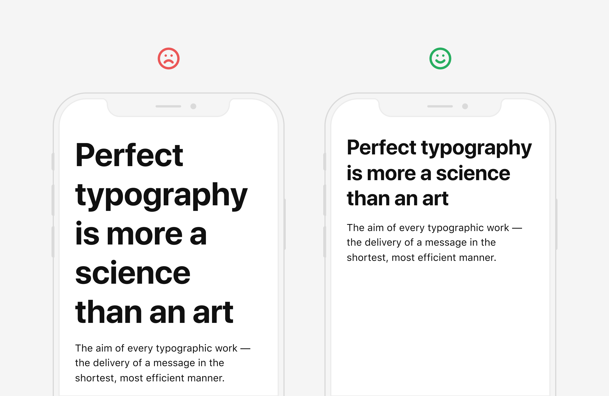
In recent years, it has become very popular to use large headings in digital typography. They look contrasted with the main text and become anchor elements on the page. But you need to be very careful when using large headers in the mobile apps. Often the use of a large size for headings in mobile apps results in the fact that a headline is stretched to 3–4 lines while contains 1 or 2 words per line. Such headers look messy and are hard to read.
Recommendations
Choose a headline size both contrasting with the body text and fitting on average 2–3 lines.
🤓 Pro-Tip
In some cases, you can use an eyebrow headline to shorten your header.
Contrast
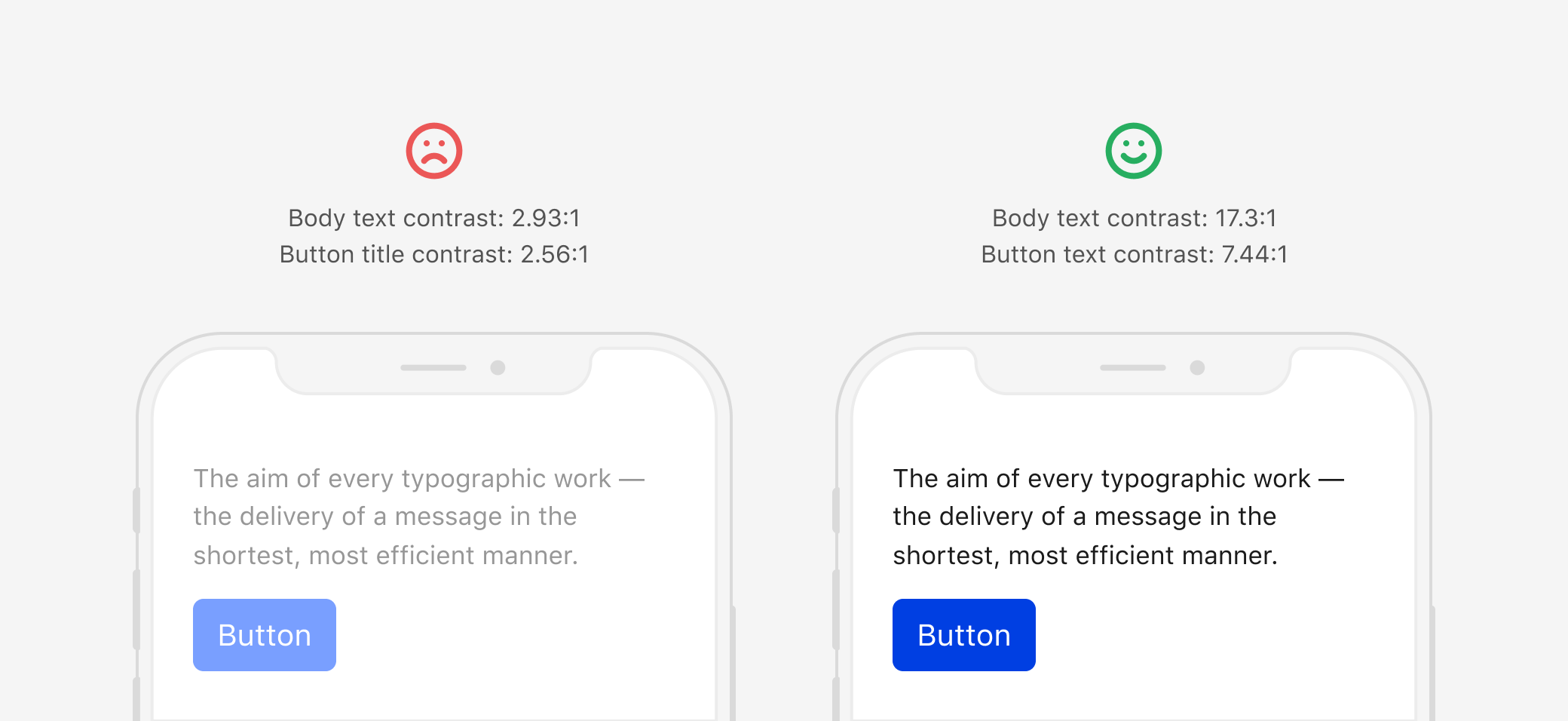
Also of the peculiarities of using mobile apps, your background and text contrast ratio is a very important parameter.
Recommendations
- Follow WCAG 2.0 Contrast Standards
- Make sure that the text you place over images has a sufficient contrast
- Provide two options for placing text on a light and a dark background
System Fonts
Currently, for iOs, you can use two system fonts: San Francisco and New York. And the Roboto font is a system font for Android these days. System fonts will make the design of your app more consistent with the operating system. But using system fonts only will prevent you from getting a unique look for your app.
Recommendations
The easiest and most common way to add accents and a unique look for the typography of your mobile app is using a system font for the body text and various controls and a non-default font for headings. This combination will always look interesting and fresh.
Commercial Fonts
Sooner or later, many designers find that system or free fonts cannot satisfy their needs for a particular project. And then they face the task of choosing a commercial font. Usually, it is the choice of commercial font that is associated with all the major difficulties. The price difference between a font for the app use and a desktop or web license will be an unpleasant surprise for you (especially if you didn’t buy this license before). For example, a license for one font style FF DIN for desktop or web costs $ 95, and $ 950 for an app 😱 (price from myfonts.com)
Recommendations
If you decide to integrate a custom font into the design of your app, you need to consider the following:
- Learn all the nuances of a license. Font distribution conditions may vary greatly
- Learn all the technical nuances of a font, such as its readability in small sizes
- Think about how your product will scale in the future. For example, it may turn out that a selected font doesn’t support Cyrillic
- Learn whether typeface has a sufficient number of weights or styles.
🤓 Pro-Tip
Search Type Foundries sites directly for fonts for your app. So you can save a large amount on a license and find more interesting styles. Below, as an example, I give some links of my favorite Type Foundrie