
I have been practising Jakob Nielsen’s 10 Usability Heuristics for User Interface Design I would like to share my experience with you all.
As Simon Sinek says in his book “START WITH WHY” I would like to start this article by explaining, Why are we supposed to do the Heuristic evaluation for user interface design?
Heuristic evaluation helps you as a designer to focus on and find usability issues that exist in the system by prototyping each flow of the product, which helps to create a useful and usable interface for the users.
According to Wang & Caldwell (2002) in their research: “The Heuristics Evaluation process for usability testing is cheaper and less time consuming.”
“Jakob Nielsen says you should do a lot of user testing if you are launching a product to avoid a lot of usability issues.”
Top 10 Usability Heuristics for Interface Design
Visibility of System Status
Match between System and the Real World
User Control and Freedom
Consistency and Standards
Error Prevention
Recognition Rather Than Recall
Flexibility and Efficiency of Use
Aesthetic and Minimalist Design
Recognize, Diagnose, and Recover from Errors
Help and Documentation
VISIBILITY OF SYSTEM STATUS
This heuristic allows users to understand how well the interface is connecting with the users and lets them know the flow at each stage.
Uploading a document on a cloud is the best example to understand how the system is connecting to users by not only showing the status of the uploading document but also allowing users to perform another task if they want to.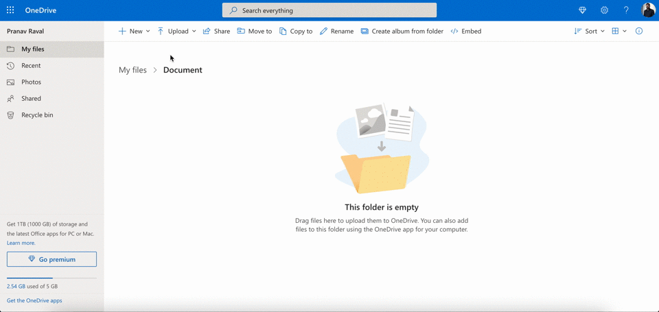 Demo uploading document on One drive
Visibility of system status is creating a relationship between the system and users. Likewise doing open-ended communication with your friends and family. Showing all the processes on the system doesn’t mean you show how the system is working on your action. Above is the perfect example where you see we have the status of uploading a document with a little pop to know let users know where you can see the status in case you are also performing another action simultaneously.
Visibility of system status is creating a relationship between the system and users. Likewise doing open-ended communication with your friends and family. Showing all the processes on the system doesn’t mean you show how the system is working on your action. Above is the perfect example where you see we have the status of uploading a document with a little pop to know let users know where you can see the status in case you are also performing another action simultaneously.
2. MATCH BETWEEN SYSTEM AND THE REAL WORLD
Design should speak users' language. Avoid using system language which is not user-friendly. For example, visiting a car showroom, and the salesperson talks about the car in detail and only talks technical terms, Car has features like CORROSION, TIMING BELT, TUNE-UP, etc. rather if they speak in users language the user might get interested in purchasing the car.
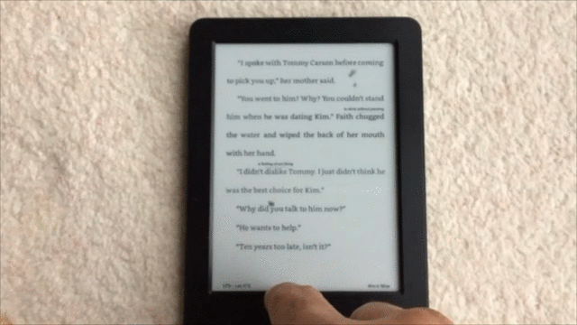
It is important to focus on the user’s previous digital experiences and their physical experiences especially when you are creating a product that digitalizes the physical product. Talking about Match between System & Real World you simply can’t ignore skeuomorphic design. Make sure when you use a skeuomorphic design you do not apply it blindly.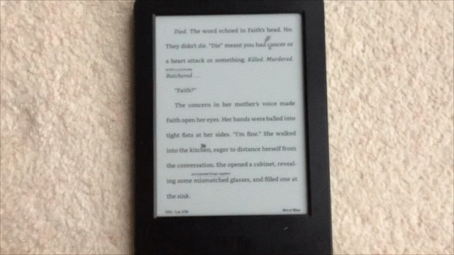 Kindle select text
 Kindle Swipe page
 Kindle bookmark page
Remember, in physical books how we use to highlight text, turn pages, and add a bookmark. Amazon kindle is the best example that Matches between the System and the Real-World convention. Users can highlight text by pressing the text for a few seconds, turn pages with a little swipe gesture, and add a bookmark on the top right corner of the screen with the bookmark icon like in the physical world.
3. USER CONTROL AND FREEDOM
“Imagine you are in a building that doesn’t have an emergency exit direction, you feel it’s a maze.”Photo by beasty. on Unsplash
The correct direction is vital when your users are accessing any of your products. Gmail is one of the best examples when you delete your email accidentally Gmail provides an undo button immediately to avoid any accidental clicks by the user.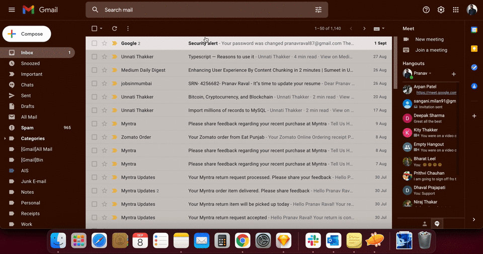 Gmail showing undo option to avoid the accidental click on delete.
Give your user a nice and clear way to cancel or close unwanted states of the page or a screen. Many UI controls allow users to go back to the previous state of the system, few of them are commonly used which are:
A back button that returns users to a previous page or screen.
The cancel button allows users to quit a task or multi-step process.
A close link allows users to close a new view or a popup window.
An Undo and Redo allow users to backtrack on a change to a UI element.
4. CONSISTENCY AND STANDARDS
“Users should not have to wonder whether different words, situations, or actions mean the same thing. Follow platform and industry conventions.”
“Consistency and standards” is key to creating applications that make sense for your users. Underline text will always be a link to another page or screen, The website logo will always be on the top left corner, a magnifying glass referred to as a search icon. These all are web conventions, breaking these conventions means breaking User Experience. Detailed research was done by NNGroup on these conventions.
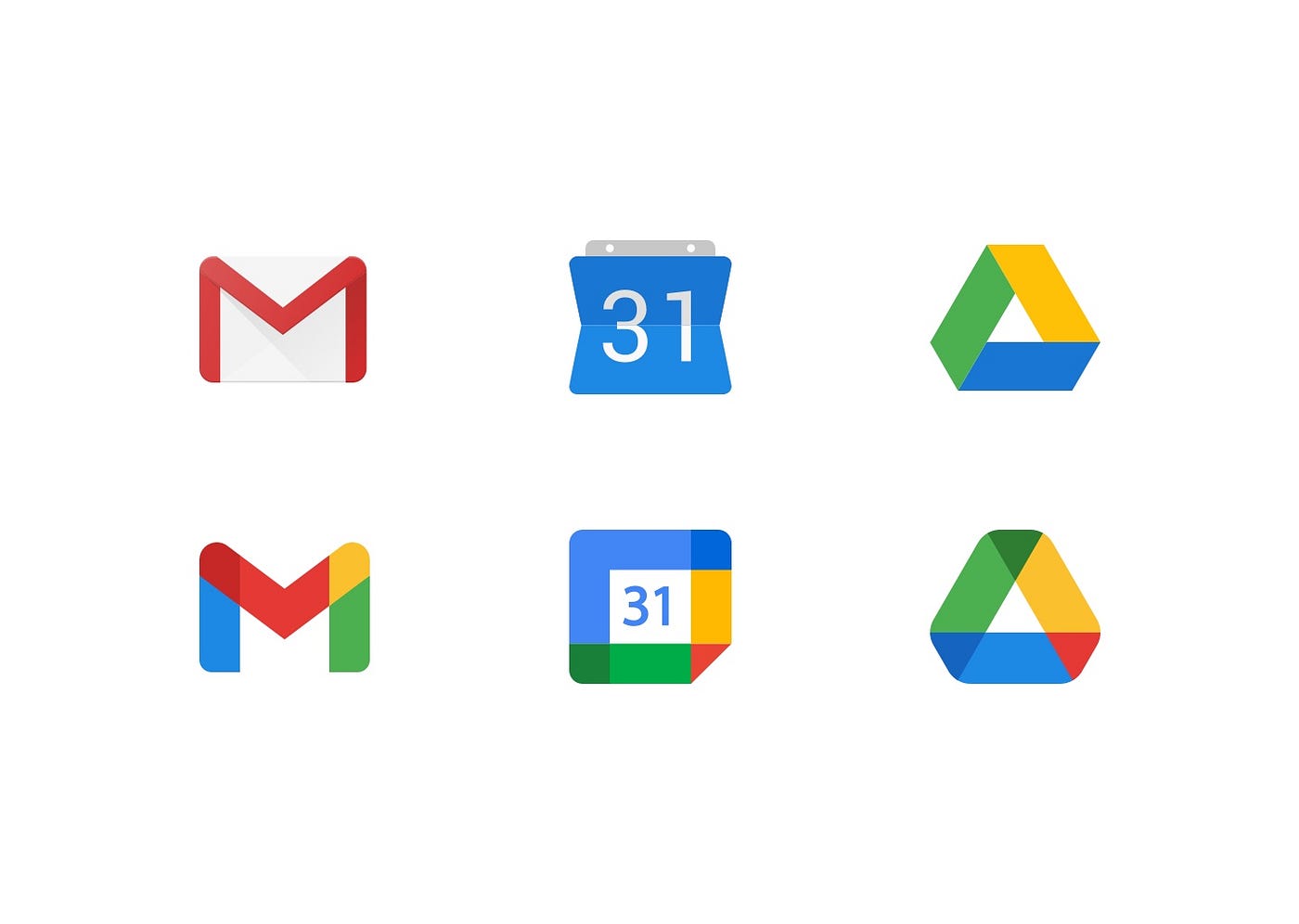 Google old and new Iconography
Following the company's colour code to all your icons is not always a good idea to follow. Google applications Gmail, Calendar, Drive (TOP) with their previous visual representation, which was consistent with other applications, but recently they have changed (Bottom) the visual representation with the same colours for all their applications. Too much of anything will kill your experience, when the user sees small icons, especially on mobile devices, these icons' similar colours will make it hard to differentiate. For best practice follow the Icon Usability before launching your products.
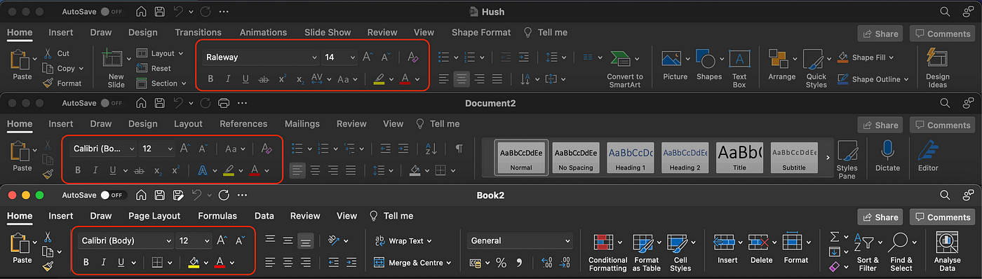 Text editor for Microsoft Office Powerpoint, Word, and Excel
Microsoft Office has too many options in its toolbar. Although they have too many options with different courses of action, they manage to show text editors in the same manner for Microsoft Office Powerpoint, Word, and Excel.
“Consistency leads to the well designed user interface for your application.”
5. ERROR PREVENTION
There is no such term called user errors. While accessing small devices like mobiles and tablets, users tend to slip or do mistakes very often. It is a good practice to go the extra mile on giving users an awesome user experience by making them aware of the action they are performing. A small message or a pop-up can help users to avoid making mistakes.
The most common design failure is showing a password error while creating a new password. I still come across many websites that do not display the requirement by the time users create a new password. Rather they show once the user submits the password. Isn’t it frustrating?
Here is another example, I tried to create a new account with Dribbble and was surprised by the experience they have with their account creation process.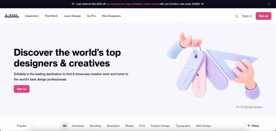 Create an account form in Dribbble.com
Here, the user is not able to get confirmation on the username that has already been taken until the user submits the form. Also, the user is not able to get a confirmation whether the password entered is matching the website's expectation or not. Although! they have shown the password requirement in the textbox, it would be great if the user can see the status of the password strength. Because it is hard to count the password entered with the same size and colour circles in that small textbox.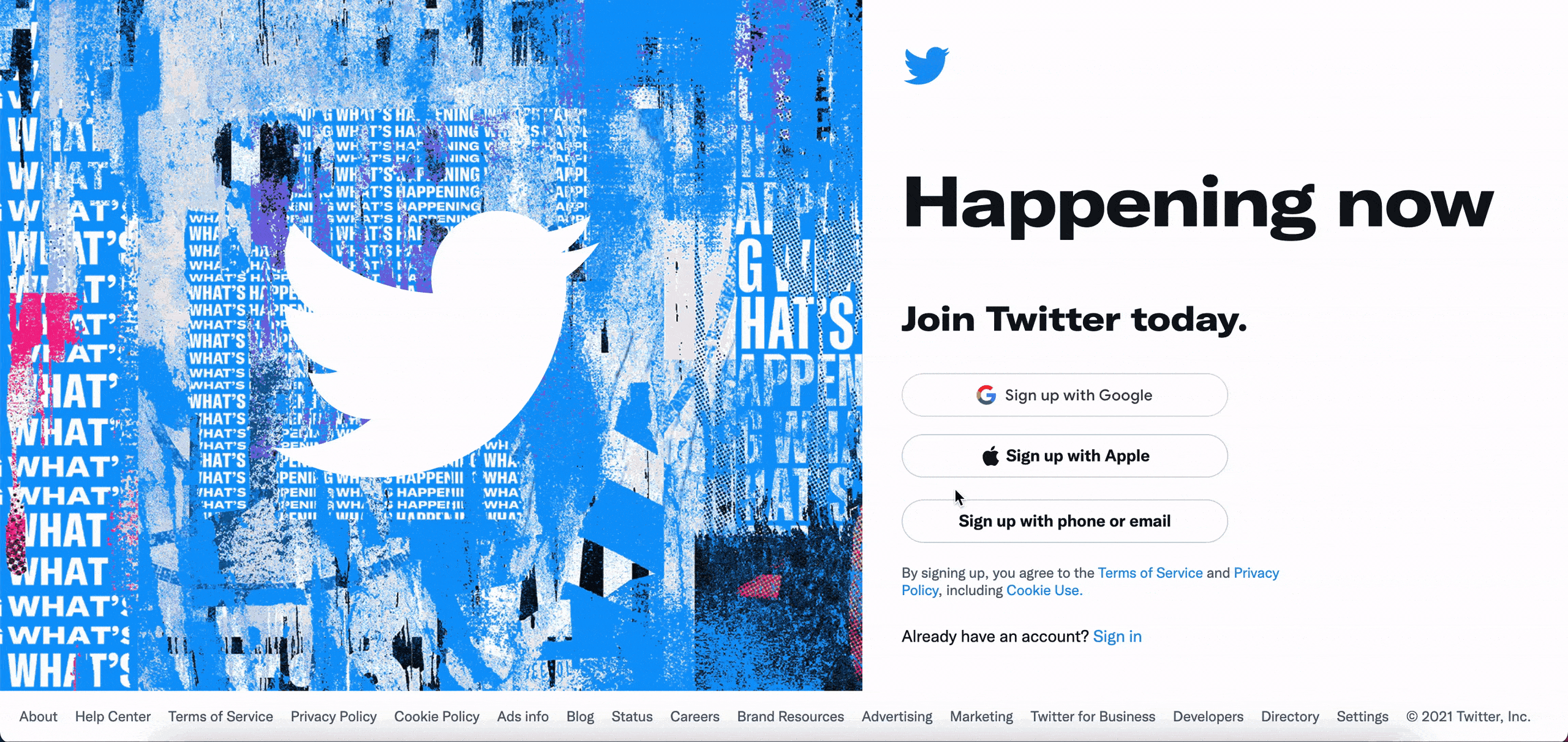 Create an account form on Twitter
The Twitter design passes the error prevention usability test in this scenario, when a user enters the email address for creating an account they immediately show an error that the email has already been taken.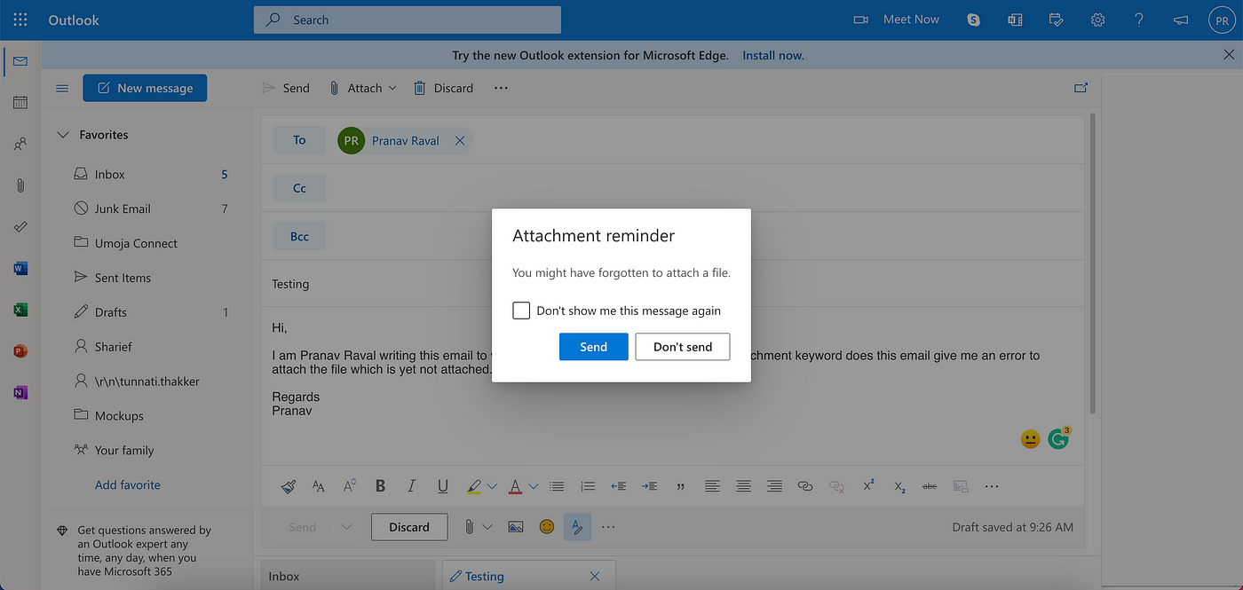 Outlook mailbox New message
Users often forget to attach the attachment while sending an email. Microsoft in their web outlook giving a reminder with a clear message that “You might have forgotten to attach a file” helps users to avoid a mistake is a great digital design example of going an extra mile and giving your user a better experience to where they tend to slip or do mistakes.
Don’t forget to check out PART II.
Thank you for reading this article, If you find it useful please share it with others.😊