
If you have not read the first part of this please click here.
6. RECOGNITION RATHER THAN RECALL
Minimize the user's effort in remembering the information by adding elements, actions, and options visible to the user. Users visiting on e-commerce websites to look for products they want to buy but, they do not buy on their first visit that is very usual behaviour from users nowadays. Rather, they always check and compare the products they like on other websites or wait for the best price or deals.
All the e-commerce websites do have a wishlist option to save for later, not all users save their favourite products in their wishlist. Keeping this in mind, working on user behaviour by showing products they looked for on their previous visit is all about recognition. Imagine you visit back to the website and have to search for the same product you liked before and forgot to add to the favourites. Amazon.in Home Page
The above image shows the products I have recently searched for. It also suggests products that I might need in the future which I bought in my past. I loved the experience of the Amazon website. Amazon is a big e-commerce website we all know, they show numerous products some of them are common from different vendors, but showing products which I have previously viewed help me not to recall and find the same product but, help me to recognize the product with the same vendor I wanted to go for.
7. FLEXIBILITY AND EFFICIENCY OF USE
Imagine you are writing an email to a large group of people using the same message with a few changes. You may apply the “COPY” command to use the same message in the other email by “selecting the message and clicking edit and clicking on copy”, or by “selecting the message then right-click on it and clicking on copy” or by just “selecting the message and tapping on Cmd+C using keyboard”. The flexibility of using the action to perform the task help newbies as well as expert users. In this scenario, the 1st or 2nd option may help newbies to get the action done. And the experts prefer to use the Cmd+C option. Showing multiple ways to copy the text in Microsoft Word.
I have experienced this usability issue in many digital products that I worked on, lacking efficiency because of less flexibility for users to choose their preferred way to act.
8. AESTHETIC AND MINIMALIST DESIGN
Aesthetic and minimalist design doesn’t mean that you have to use a flat design or monochromatic colour palette. It means you make sure that the content or the visual elements you use should focus on the essentials.
This is related to the human-computer interaction concept called the signal-to-noise ratio. The signal-to-noise ratio means the element we use in the website or the digital product should be more relevant and less irrelevant. The elements we use could be anything like text content, images, videos, or animations.
Anything that users have to process could count as a signal or noise (relevant or irrelevant). To improve the efficiency of communicating through your designs and to help users to complete their tasks, target for a high signal-to-noise ratio.
You should avoid adding images, videos, or animations to look pretty or to cover the white space.
Communicate, don’t decorate.
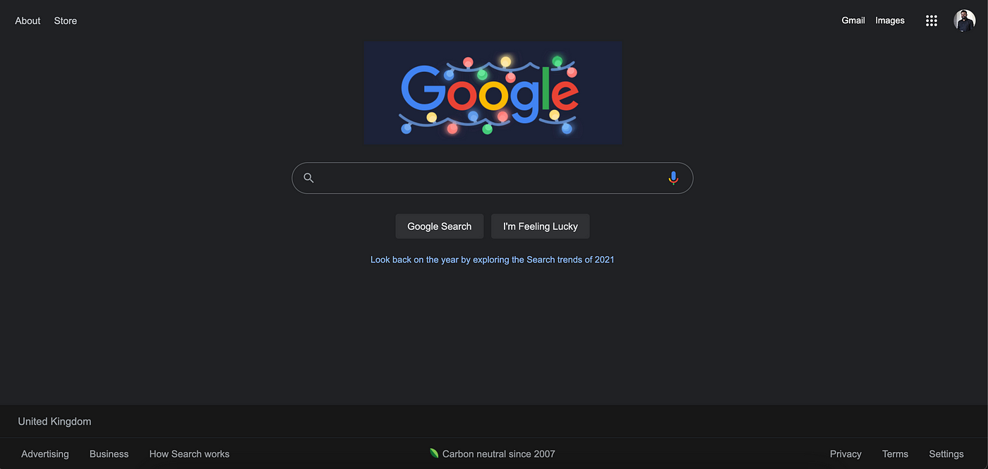 Google.com home page.
Google is the best example to show when it comes to aesthetic and minimalist design. Google only shows fields or content which is relevant to the user. It has never changed in the years since they started.
 Image Credits: Wikipedia
9. RECOGNIZE, DIAGNOSE, AND RECOVER FROM ERRORS
Give users the information which gives them an idea of what could be the case that he/she is not able to get the result after an action they performed using your product. I will walk through some of the best examples that explain how you could help your users to recognize, diagnose and recover from errors.
Inform your users what the error is. Rightmove does a great job of recognizing the error as soon as the user skips the mandatory information while creating an account.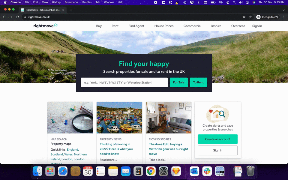 https://www.rightmove.co.uk/
Tell your users what went wrong and what the problem is? Use the layman language which helps the user to understand the error easily.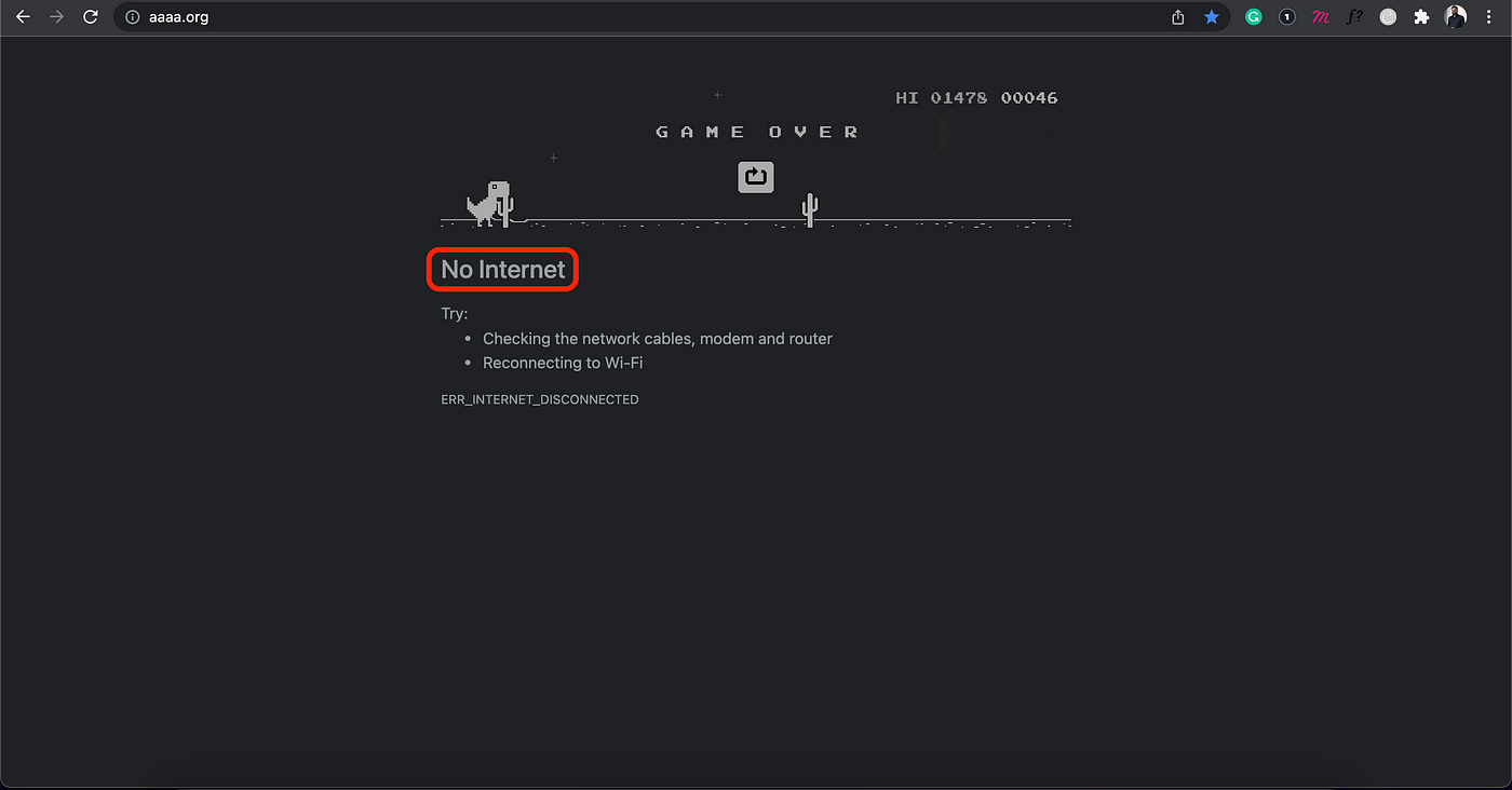 Google Chrome with an error message
Google Chrome error message is quite clear and also in a very simple language. When not connected to the internet we usually get this error. Imagine the time you spent to know, that you are not connected to the internet. Chrome also go the extra mile to connect their users even when there is no internet connection by the Dinosaur Game. Chrome with the solution to an error user received
You should allow users to fix the error. And chrome does that on the same page by giving troubleshooting options just below the error message. These try troubleshooting can resolve their problem immediately if that is something users are having issues with.
The best thing we can do for our users to recover from the error is to come up with a solution to prevent those errors in the very first place. And that is one of the 10 Usability Heuristics #5 error prevention. Do check out the 1st part of this article to know more about error prevention.
10. HELP AND DOCUMENTATION
We as UX designers aim to create products and services easy as possible for our users to use. Sometimes users need help, imagine a small mobile application that has many gestures a user can perform. So, help and documentation are really helpful.
Help and documentation can be used in different ways like App onboarding pages, walkthroughs, tooltips, popovers, videos, chatbots, etc. For non-digital products, we always find a small manual book we receive with the product that can help users to use if they are stuck in using or building a product for example how to use a fridge or how to build a stroller?
Let’s look at the example from Microsoft. We all know how big Microsoft word is for each type of user that includes a novice to an expert. Microsoft Word Help & Documentation
Microsoft did fantastic work in helping their user by using the simple language where you see “Tell me” with a bulb icon which helps us to understand that this is the place where I can find help. Secondly, they have no text limitation to search for. Also, they have suggestions for the user to understand how they type their requirements to understand the action.
I had a bad experience with help & documentation. I have installed a new boiler in my home and the engineers provided me with the manual to look into if you have any questions. After a couple of days, it started showing me an error on the screen “F-28”. I quickly grabbed the manual book and started looking for the error message to understand what that means. I did not find any error codes in that manual that could show on the boiler screen.
I had to call the engineer to understand that and they did ask me for some troubleshooting which could have been done without calling them. It is good to show all the information that belongs to your product into your help & documentation. Here, if I would have found all the error messages which the boiler can show could have reduced my efforts in finding the meaning and calling an engineer.
Thank you for reading this article, If you find it helpful please share it with others 😊.